MongolListTile class
A single fixed-width column that typically contains some text as well as a leading or trailing icon.
This widget is the vertical text version of ListTile.
A list tile contains one to three lines of text optionally flanked by icons or other widgets, such as check boxes. The icons (or other widgets) for the tile are defined with the leading and trailing parameters. The first line of text is not optional and is specified with title. The value of subtitle, which is optional, will occupy the space allocated for an additional line of text, or two lines if isThreeLine is true. If dense is true then the overall width of this tile and the size of the DefaultTextStyles that wrap the title and subtitle widget are reduced.
It is the responsibility of the caller to ensure that title does not wrap, and to ensure that subtitle doesn't wrap (if isThreeLine is false) or wraps to two lines (if it is true).
The widths of the leading and trailing widgets are constrained according to the Material spec. An exception is made for one-line MongolListTiles for accessibility. Please see the example below to see how to adhere to both Material spec and accessibility requirements.
Note that leading and trailing widgets can expand as far as they wish vertically, so ensure that they are properly constrained.
List tiles are typically used in horizontal ListViews, or arranged in Rowss in
MongolDrawers and Cards.
Requires one of its ancestors to be a Material widget.
{@tool snippet}
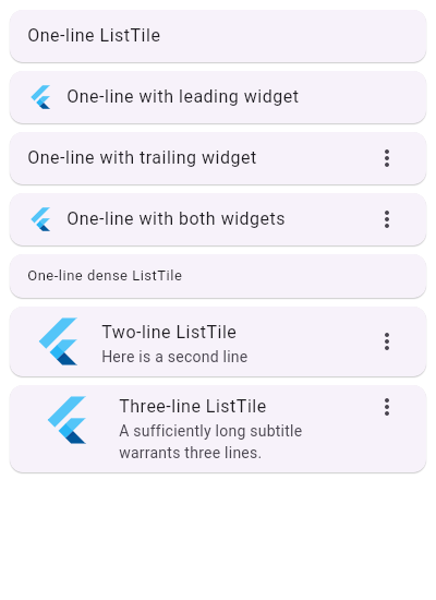
This example uses a ListView to demonstrate different configurations of MongolListTiles in Cards.
ListView(
  scrollDirection: Axis.horizontal,
  children: const <Widget>[
    Card(child: MongolListTile(title: Text('One-line MongolListTile'))),
    Card(
      child: MongolListTile(
        leading: FlutterLogo(),
        title: MongolText('One-line with leading widget'),
      ),
    ),
    Card(
      child: MongolListTile(
        title: MongolText('One-line with trailing widget'),
        trailing: Icon(Icons.more_vert),
      ),
    ),
    Card(
      child: MongolListTile(
        leading: FlutterLogo(),
        title: MongolText('One-line with both widgets'),
        trailing: Icon(Icons.more_vert),
      ),
    ),
    Card(
      child: MongolListTile(
        title: MongolText('One-line dense MongolListTile'),
        dense: true,
      ),
    ),
    Card(
      child: MongolListTile(
        leading: FlutterLogo(size: 56.0),
        title: MongolText('Two-line MongolListTile'),
        subtitle: MongolText('Here is a second line'),
        trailing: Icon(Icons.more_vert),
      ),
    ),
    Card(
      child: MongolListTile(
        leading: FlutterLogo(size: 72.0),
        title: MongolText('Three-line MongolListTile'),
        subtitle: MongolText(
          'A sufficiently long subtitle warrants three lines.'
        ),
        trailing: Icon(Icons.more_vert),
        isThreeLine: true,
      ),
    ),
  ],
)
{@end-tool} {@tool snippet}
To use a MongolListTile within a Column, it needs to be wrapped in an Expanded widget. MongolListTile requires fixed height constraints, whereas a Column does not constrain its children.
Column(
  children: const <Widget>[
    Expanded(
      child: MongolListTile(
        leading: FlutterLogo(),
        title: MongolText('These MongolListTiles are expanded '),
      ),
    ),
    Expanded(
      child: MongolListTile(
        trailing: FlutterLogo(),
        title: MongolText('to fill the available space.'),
      ),
    ),
  ],
)
{@end-tool} {@tool snippet}
Tiles can be much more elaborate. Here is a tile which can be tapped, but
which is disabled when the _act variable is not 2. When the tile is
tapped, the whole column has an ink splash effect (see InkWell).
int _act = 1;
// ...
MongolListTile(
  leading: const Icon(Icons.flight_land),
  title: const MongolText("Trix's airplane"),
  subtitle: _act != 2 ? const MongolText('The airplane is only in Act II.') : null,
  enabled: _act == 2,
  onTap: () { /* react to the tile being tapped */ }
)
{@end-tool}
To be accessible, tappable leading and trailing widgets have to be at least 48x48 in size. However, to adhere to the Material spec, trailing and leading widgets in one-line MongolListTiles should visually be at most 32 (dense: true) or 40 (dense: false) in width, which may conflict with the accessibility requirement.
For this reason, a one-line MongolListTile allows the width of leading and trailing widgets to be constrained by the width of the MongolListTile. This allows for the creation of tappable leading and trailing widgets that are large enough, but it is up to the developer to ensure that their widgets follow the Material spec.
{@tool snippet}
Here is an example of a one-line, non-dense MongolListTile with a tappable leading widget that adheres to accessibility requirements and the Material spec. To adjust the use case below for a one-line, dense MongolListTile, adjust the horizontal padding to 8.0.
MongolListTile(
  leading: GestureDetector(
    behavior: HitTestBehavior.translucent,
    onTap: () {},
    child: Container(
      width: 48,
      height: 48,
      padding: const EdgeInsets.symmetric(horizontal: 4.0),
      alignment: Alignment.center,
      child: const CircleAvatar(),
    ),
  ),
  title: const MongolText('title'),
  dense: false,
),
{@end-tool}
See also:
- MongolListTileTheme, which defines visual properties for MongolListTiles.
- ListView, which can display an arbitrary number of MongolListTiles in a scrolling list.
- CircleAvatar, which shows an icon representing a person and is often used as the leading element of a MongolListTile.
- Card, which can be used with Row to show a few MongolListTiles.
- VerticalDivider, which can be used to separate MongolListTiles.
- MongolListTile.divideTiles, a utility for inserting VerticalDividers in between MongolListTiles.
- material.io/design/components/lists.html
- Cookbook: Use lists
- Cookbook: Implement swipe to dismiss
- Inheritance
-
- Object
- DiagnosticableTree
- Widget
- StatelessWidget
- MongolListTile
Constructors
- MongolListTile({Key? key, Widget? leading, Widget? title, Widget? subtitle, Widget? trailing, bool isThreeLine = false, bool? dense, VisualDensity? visualDensity, ShapeBorder? shape, EdgeInsetsGeometry? contentPadding, bool enabled = true, GestureTapCallback? onTap, GestureLongPressCallback? onLongPress, MouseCursor? mouseCursor, bool selected = false, Color? focusColor, Color? hoverColor, FocusNode? focusNode, bool autofocus = false, Color? tileColor, Color? selectedTileColor, bool? enableFeedback, double? verticalTitleGap, double? minHorizontalPadding, double? minLeadingHeight})
-
Creates a vertical list tile.
const
Properties
- autofocus → bool
-
True if this widget will be selected as the initial focus when no other
node in its scope is currently focused.
final
- contentPadding → EdgeInsetsGeometry?
-
The tile's internal padding.
final
- dense → bool?
-
Whether this list tile is part of a horizontally dense list.
final
- enabled → bool
-
Whether this list tile is interactive.
final
- enableFeedback → bool?
-
Whether detected gestures should provide acoustic and/or haptic feedback.
final
- focusColor → Color?
-
The color for the tile's Material when it has the input focus.
final
- focusNode → FocusNode?
-
An optional focus node to use as the focus node for this widget.
final
- hashCode → int
-
The hash code for this object.
no setterinherited
- hoverColor → Color?
-
The color for the tile's Material when a pointer is hovering over it.
final
- isThreeLine → bool
-
Whether this list tile is intended to display three lines of text.
final
- key → Key?
-
Controls how one widget replaces another widget in the tree.
finalinherited
- leading → Widget?
-
A widget to display above the title.
final
- minHorizontalPadding → double?
-
The minimum padding on the left and right of the title and subtitle widgets.
final
- minLeadingHeight → double?
-
The minimum height allocated for the MongolListTile.leading widget.
final
- mouseCursor → MouseCursor?
-
The cursor for a mouse pointer when it enters or is hovering over the
widget.
final
- onLongPress → GestureLongPressCallback?
-
Called when the user long-presses on this list tile.
final
- onTap → GestureTapCallback?
-
Called when the user taps this list tile.
final
- runtimeType → Type
-
A representation of the runtime type of the object.
no setterinherited
- selected → bool
-
If this tile is also enabled then icons and text are rendered with the same color.
final
- selectedTileColor → Color?
-
Defines the background color of
MongolListTilewhen selected is true.final - shape → ShapeBorder?
-
The tile's shape.
final
- subtitle → Widget?
-
Additional content displayed below the title.
final
- tileColor → Color?
-
Defines the background color of
MongolListTilewhen selected is false.final - title → Widget?
-
The primary content of the list tile.
final
- trailing → Widget?
-
A widget to display under the title.
final
- verticalTitleGap → double?
-
The vertical gap between the titles and the leading/trailing widgets.
final
- visualDensity → VisualDensity?
-
Defines how compact the list tile's layout will be.
final
Methods
-
build(
BuildContext context) → Widget -
Describes the part of the user interface represented by this widget.
override
-
createElement(
) → StatelessElement -
Creates a StatelessElement to manage this widget's location in the tree.
inherited
-
debugDescribeChildren(
) → List< DiagnosticsNode> -
Returns a list of
DiagnosticsNodeobjects describing this node's children.inherited -
debugFillProperties(
DiagnosticPropertiesBuilder properties) → void -
Add additional properties associated with the node.
inherited
-
noSuchMethod(
Invocation invocation) → dynamic -
Invoked when a nonexistent method or property is accessed.
inherited
-
toDiagnosticsNode(
{String? name, DiagnosticsTreeStyle? style}) → DiagnosticsNode -
Returns a debug representation of the object that is used by debugging
tools and by DiagnosticsNode.toStringDeep.
inherited
-
toString(
{DiagnosticLevel minLevel = DiagnosticLevel.info}) → String -
A string representation of this object.
inherited
-
toStringDeep(
{String prefixLineOne = '', String? prefixOtherLines, DiagnosticLevel minLevel = DiagnosticLevel.debug}) → String -
Returns a string representation of this node and its descendants.
inherited
-
toStringShallow(
{String joiner = ', ', DiagnosticLevel minLevel = DiagnosticLevel.debug}) → String -
Returns a one-line detailed description of the object.
inherited
-
toStringShort(
) → String -
A short, textual description of this widget.
inherited
Operators
-
operator ==(
Object other) → bool -
The equality operator.
inherited
Static Methods
-
divideTiles(
{BuildContext? context, required Iterable< Widget> tiles, Color? color}) → Iterable<Widget> - Add a one pixel border in between each tile. If color isn't specified the ThemeData.dividerColor of the context's Theme is used.