fluid_layout 1.0.0-dev  fluid_layout: ^1.0.0-dev copied to clipboard
 jaimeblasco.com
Create responsive layouts in flutter for mobile, web and desktop.
Fluid Layout #

Demo: jamesblasco.github.io/fluid_layout
Fluid layout allows you to create responsive layout for mobile, web and desktop from a single codebase.
Let's get started #
Install it #
Follow the installation process here
Understand fluid layout #
Fluid layout aims to help building a responsive experience through all the different screen sizes.
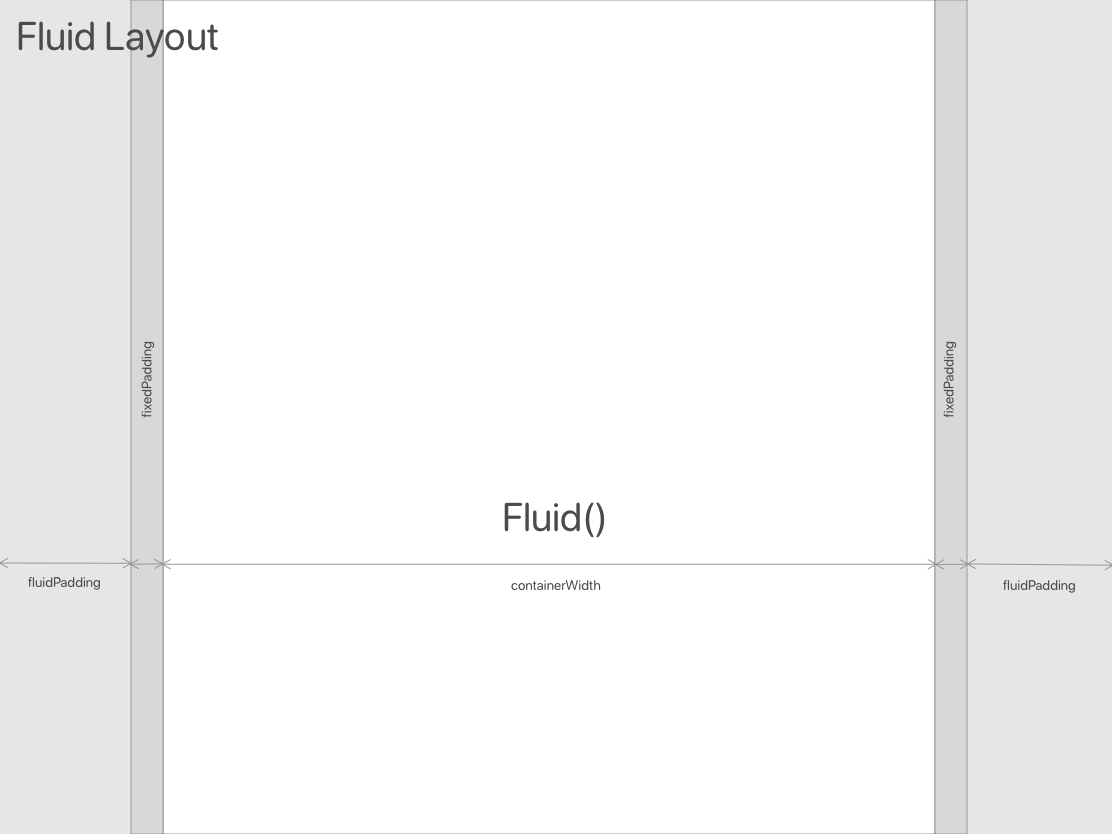
Based in the boostrap approach, FluidLayout calculates a padding content (fluid_padding) that changes depending on the parent size. The FluidPadding widget uses that padding to set its size
The screen sizes are divided in 8 breakpoints: ul, xs, s, m, l, xl, ul, and can be accessed through FluidLayout.of(context).breakpoint or context.fluid.breakpoint.
You can create values(int, num, objects, functions, ... whatever variable type) for diferrent screen sizes thanks to the class BreakpointValue. The easiest way is:
final value = context.fluid.value(defaultValue,
  xs: xsValue,  //if null xs would be defaultValue
  s:  sValue,   //if null s would be defaultValue
  m:  mValue,   //if null m would be defaultValue
  l:  lValue,   //if null l would be defaultValue
  xl: xlValue   //if null xl would be defaultValue
 )
LayoutFormat #
By default, LayoutFormat uses the FluidFormat to calculate the breakpoints, the padding and margin for each width.
FluidFormat dinamically changes the page size proportionally to the container width. It uses the
breakpoints defined by the material guidelines.
BoostrapFormat adapts the page size according to the breakpoints defined by the boostrap guidelines.
You can also extend LayoutFormat and define you own custom rules for the layout.
Examples #
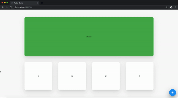
FluidLayout & FluidPadding #
See web example
class BasicFluidLayout extends StatelessWidget {
  @override
  Widget build(BuildContext context) {
    return FluidLayout(
      child: Scaffold(
        backgroundColor: Colors.grey[200],
        body: FluidPadding(
          child: Container(
            child: Text(
              'Fluid width',
              style: TextStyle(color: Colors.white),
            ),
            color: Colors.blue,
            alignment: Alignment.center,
          ),
        ),
      ),
    );
  }
}
There is a fixed margin param that can be changed to all the FluidLayout or just for a FluidPadding container
For CustomScrollView there is a SliverFluidPadding equivalent to FluidPadding
FluidGridView #
A staggered grid view that divides the width size in 12 columns and makes easy to build responsive grid layout
FluidGridView(
  children: List.filled(
    100,
    FluidCell.withFluidHeight(
      size: context.fluid.value(3, m: 3, s: 4, xs: 6), //max 12
      heightSize: context.fluid.value(3, m: 3, s: 4, xs: 6), // max 12
      child: Container(
        color: Colors.red,
        child: Center(child: Text('Item')),
      )),
    ),
)
Customizable params [double spacing, ScrollPhysics physics, bool shrinkWrap] and bool fluid
FluidCell has three methods to build the cell:
FluidCell.fit({size, child})FluidCell.withFluidHeight({size, heightSize, child})FluidCell.withFixedHeight({size, height, child})
For CustomScrollView there is a SliverFluidGrid equivalent to FluidGridView
Conditional Layout #
See Conditional Layout web example
if(context.fluid.breakpoint.isLargerThanM)
   return Container(color: Colors.red)
else
   return Container(color: Colors.green)
Remember you can use context.breakpoint or FluidLayout.of(context).breakpoint
Combine full width widgets with fluid layouts #
Fluid layouts can be built everywhere inside the app and they will calculate their constraints based on their parents sizes, also they can combine very easily in cases we need full screen widgets.
Metadata
Publisher
Metadata
Create responsive layouts in flutter for mobile, web and desktop.
Repository (GitHub)
View/report issues
License
 MIT (LICENSE)
Dependencies
flutter, flutter_staggered_grid_view, gap