DropdownButton2<T> class
A Material Design button for selecting from a list of items.
A dropdown button lets the user select from a number of items. The button shows the currently selected item as well as an arrow that opens a menu for selecting another item.
One ancestor must be a Material widget and typically this is provided by the app's Scaffold.
The type T is the type of the value that each dropdown item represents.
All the entries in a given menu must represent values with consistent types.
Typically, an enum is used. Each DropdownMenuItem in items must be
specialized with that same type argument.
The onChanged callback should update a state variable that defines the dropdown's value. It should also call State.setState to rebuild the dropdown with the new value.
{@tool dartpad}
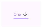
This sample shows a DropdownButton with a large arrow icon,
purple text style, and bold purple underline, whose value is one of "One",
"Two", "Free", or "Four".
** See code in examples/api/lib/material/dropdown/dropdown_button.0.dart ** {@end-tool}
If the onChanged callback is null or the list of items is null then the dropdown button will be disabled, i.e. its arrow will be displayed in grey and it will not respond to input. A disabled button will display the disabledHint widget if it is non-null. However, if disabledHint is null and hint is non-null, the hint widget will instead be displayed.
Requires one of its ancestors to be a Material widget.
See also:
- DropdownButtonFormField2, which integrates with the Form widget.
- DropdownMenuItem, the class used to represent the items.
- DropdownButtonHideUnderline, which prevents its descendant dropdown buttons from displaying their underlines.
- ElevatedButton, TextButton, ordinary buttons that trigger a single action.
- material.io/design/components/menus.html#dropdown-menu
- Inheritance
-
- Object
- DiagnosticableTree
- Widget
- StatefulWidget
- DropdownButton2
Constructors
-
DropdownButton2({Key? key, required List<
DropdownMenuItem< ? items, DropdownButtonBuilder? selectedItemBuilder, T? value, Widget? hint, Widget? disabledHint, ValueChanged<T> >T?> ? onChanged, _OnMenuStateChangeFn? onMenuStateChange, int dropdownElevation = 8, TextStyle? style, Widget? underline, Widget? icon, Widget? iconOnClick, Color? iconDisabledColor, Color? iconEnabledColor, double iconSize = 24.0, bool isDense = false, bool isExpanded = false, double itemHeight = kMinInteractiveDimension, Color? focusColor, FocusNode? focusNode, bool autofocus = false, double? dropdownMaxHeight, bool? enableFeedback, AlignmentGeometry alignment = AlignmentDirectional.centerStart, double? buttonHeight, double? buttonWidth, EdgeInsetsGeometry? buttonPadding, BoxDecoration? buttonDecoration, int? buttonElevation, Color? buttonSplashColor, Color? buttonHighlightColor, MaterialStateProperty<Color?> ? buttonOverlayColor, EdgeInsetsGeometry? itemPadding, Color? itemSplashColor, Color? itemHighlightColor, double? dropdownWidth, EdgeInsetsGeometry? dropdownPadding, EdgeInsetsGeometry? dropdownScrollPadding, BoxDecoration? dropdownDecoration, DropdownDirection dropdownDirection = DropdownDirection.textDirection, Color? selectedItemHighlightColor, Radius? scrollbarRadius, double? scrollbarThickness, bool? scrollbarAlwaysShow, Offset? offset, Widget? customButton, List<double> ? customItemsHeights, bool openWithLongPress = false, bool dropdownOverButton = false, bool dropdownFullScreen = false, bool barrierDismissible = true, Color? barrierColor, String? barrierLabel, TextEditingController? searchController, Widget? searchInnerWidget, double? searchInnerWidgetHeight, _SearchMatchFn<T> ? searchMatchFn}) - Creates a DropdownButton2 It's customizable DropdownButton with steady dropdown menu and many other features.
Properties
- alignment → AlignmentGeometry
-
Defines how the hint or the selected item is positioned within the button.
final
- autofocus → bool
-
True if this widget will be selected as the initial focus when no other
node in its scope is currently focused.
final
- barrierColor → Color?
-
The color to use for the modal barrier. If this is null, the barrier will
be transparent.
final
- barrierDismissible → bool
-
Whether you can dismiss this route by tapping the modal barrier.
final
- barrierLabel → String?
-
The semantic label used for a dismissible barrier.
final
-
The decoration of the Button
final
-
The elevation of the Button
final
-
The height of the button.
final
-
The highlight color of the button's InkWell
final
-
The overlay color of the button's Inkwell
final
-
The inner padding of the Button
final
-
The splash color of the button's InkWell
final
-
The width of the button
final
- customButton → Widget?
-
Uses custom widget like icon,image,etc.. instead of the default button
final
-
customItemsHeights
→ List<
double> ? -
Uses different predefined heights for the menu items (useful for adding dividers)
final
- disabledHint → Widget?
-
A preferred placeholder widget that is displayed when the dropdown is disabled.
final
- dropdownDecoration → BoxDecoration?
-
The decoration of the dropdown menu
final
- dropdownDirection → DropdownDirection
-
The direction of the dropdown menu in relation to the button.
final
- dropdownElevation → int
-
The z-coordinate at which to place the menu when open.
final
- dropdownFullScreen → bool
-
Opens the dropdown menu in fullscreen mode (Above AppBar & TabBar)
final
- dropdownMaxHeight → double?
-
The maximum height of the menu.
final
- dropdownOverButton → bool
-
Opens the dropdown menu over the button instead of below it
final
- dropdownPadding → EdgeInsetsGeometry?
-
The inner padding of the dropdown menu
final
- dropdownScrollPadding → EdgeInsetsGeometry?
-
The inner padding of the dropdown menu including the scrollbar
final
- dropdownWidth → double?
-
The width of the dropdown menu
final
- enableFeedback → bool?
-
Whether detected gestures should provide acoustic and/or haptic feedback.
final
- focusColor → Color?
-
The color for the button's Material when it has the input focus.
final
- focusNode → FocusNode?
-
An optional focus node to use as the focus node for this widget.
final
- formFieldCallBack → _OnMenuStateChangeFn?
-
Called when the dropdown menu is opened or closed in case of using
DropdownButtonFormField2 to update the FormField's focus.
final
- hashCode → int
-
The hash code for this object.
no setterinherited
- hint → Widget?
-
A placeholder widget that is displayed by the dropdown button.
final
- icon → Widget?
-
The widget to use for the drop-down button's icon.
final
- iconDisabledColor → Color?
-
The color of any Icon descendant of icon if this button is disabled,
i.e. if onChanged is null.
final
- iconEnabledColor → Color?
-
The color of any Icon descendant of icon if this button is enabled,
i.e. if onChanged is defined.
final
- iconOnClick → Widget?
-
Shows different icon when dropdown menu open
final
- iconSize → double
-
The size to use for the drop-down button's icon.
final
- isDense → bool
-
Reduce the button's height.
final
- isExpanded → bool
-
Set the dropdown's inner contents to horizontally fill its parent.
final
- itemHeight → double
-
The default value is kMinInteractiveDimension
final
- itemHighlightColor → Color?
-
The highlight color of the item's InkWell
final
- itemPadding → EdgeInsetsGeometry?
-
The padding of menu items
final
-
items
→ List<
DropdownMenuItem< ?T> > -
The list of items the user can select.
final
- itemSplashColor → Color?
-
The splash color of the item's InkWell
final
- key → Key?
-
Controls how one widget replaces another widget in the tree.
finalinherited
- offset → Offset?
-
Changes the position of the dropdown menu
final
-
onChanged
→ ValueChanged<
T?> ? -
Called when the user selects an item.
final
- onMenuStateChange → _OnMenuStateChangeFn?
-
Called when the dropdown menu is opened or closed.
final
- openWithLongPress → bool
-
Opens the dropdown menu on long-pressing instead of tapping
final
- runtimeType → Type
-
A representation of the runtime type of the object.
no setterinherited
- scrollbarAlwaysShow → bool?
-
Always show the scrollbar even when a scroll is not underway
final
- scrollbarRadius → Radius?
-
The radius of the scrollbar's corners
final
- scrollbarThickness → double?
-
The thickness of the scrollbar
final
- searchController → TextEditingController?
-
The TextEditingController used for searchable dropdowns. If this is null,
then it'll perform as a normal dropdown without searching feature.
final
- searchInnerWidget → Widget?
-
The widget to use for searchable dropdowns, such as search bar.
It will be shown at the top of the dropdown menu.
final
- searchInnerWidgetHeight → double?
-
The height of the searchInnerWidget if used.
final
-
searchMatchFn
→ _SearchMatchFn<
T> ? -
The match function used for searchable dropdowns. If this is null,
then _defaultSearchMatchFn will be used.
final
- selectedItemBuilder → DropdownButtonBuilder?
-
A builder to customize the dropdown buttons corresponding to the
DropdownMenuItems in items.
final
- selectedItemHighlightColor → Color?
-
The highlight color of the current selected item
final
- style → TextStyle?
-
The text style to use for text in the dropdown button and the dropdown
menu that appears when you tap the button.
final
- underline → Widget?
-
The widget to use for drawing the drop-down button's underline.
final
- value → T?
-
The value of the currently selected DropdownMenuItem.
final
Methods
-
createElement(
) → StatefulElement -
Creates a StatefulElement to manage this widget's location in the tree.
inherited
-
createState(
) → State< DropdownButton2< T> > -
Creates the mutable state for this widget at a given location in the tree.
override
-
debugDescribeChildren(
) → List< DiagnosticsNode> -
Returns a list of DiagnosticsNode objects describing this node's
children.
inherited
-
debugFillProperties(
DiagnosticPropertiesBuilder properties) → void -
Add additional properties associated with the node.
inherited
-
noSuchMethod(
Invocation invocation) → dynamic -
Invoked when a nonexistent method or property is accessed.
inherited
-
toDiagnosticsNode(
{String? name, DiagnosticsTreeStyle? style}) → DiagnosticsNode -
Returns a debug representation of the object that is used by debugging
tools and by DiagnosticsNode.toStringDeep.
inherited
-
toString(
{DiagnosticLevel minLevel = DiagnosticLevel.info}) → String -
A string representation of this object.
inherited
-
toStringDeep(
{String prefixLineOne = '', String? prefixOtherLines, DiagnosticLevel minLevel = DiagnosticLevel.debug}) → String -
Returns a string representation of this node and its descendants.
inherited
-
toStringShallow(
{String joiner = ', ', DiagnosticLevel minLevel = DiagnosticLevel.debug}) → String -
Returns a one-line detailed description of the object.
inherited
-
toStringShort(
) → String -
A short, textual description of this widget.
inherited
Operators
-
operator ==(
Object other) → bool -
The equality operator.
inherited