selectable_circle 0.1.2  selectable_circle: ^0.1.2 copied to clipboard
A Circle that can be showed as selected and as not Selected. Default selecting starts a flare animation.
selectable_circle #
A Flutter package for an Circle that can be Selected with animation.
How to use #
SelectableCircleText(
    width: 80.0,
    onSelected: () {
    setState(() {
        _isSelected2 = !_isSelected2;
    });
    },
    child: Icon(Icons.star),
);
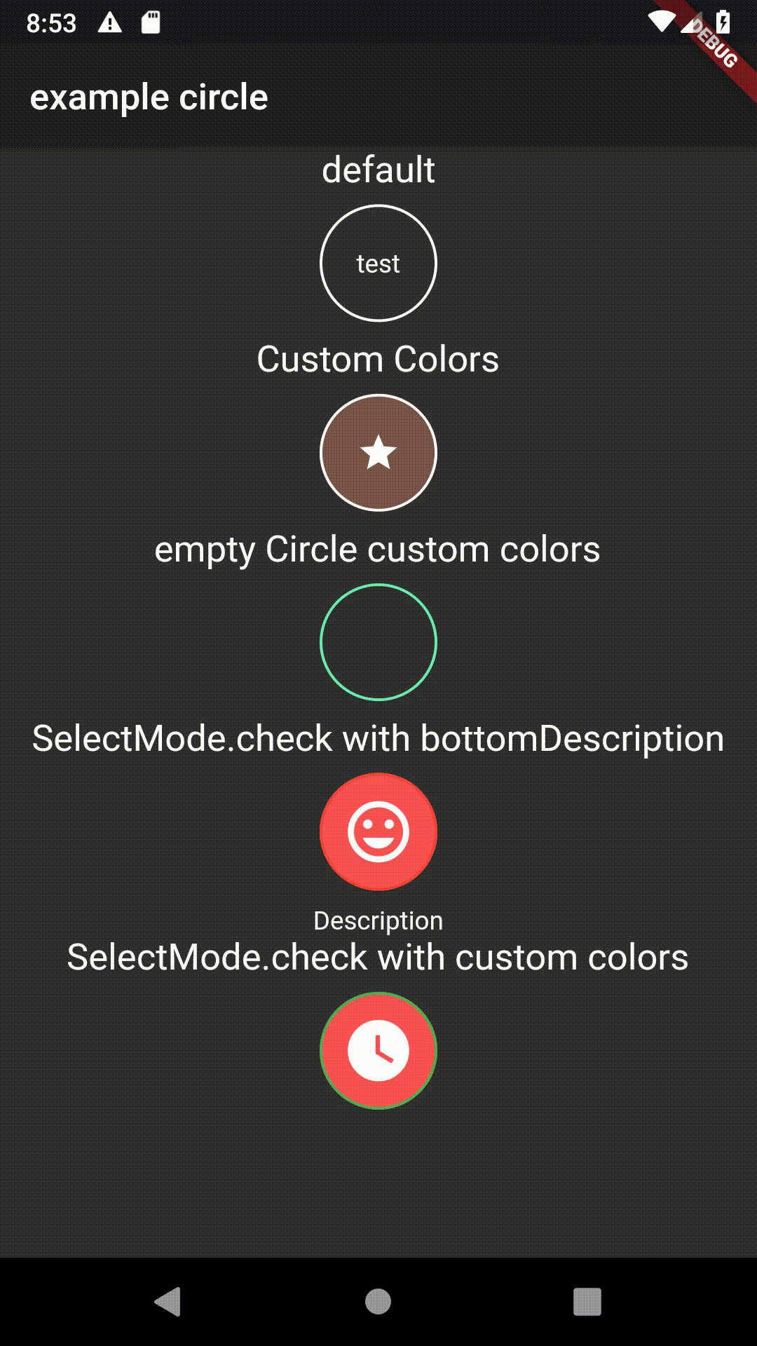
Screenshot #

Parameters #
    /// the width and height of the CircleWidget
final double width;

/// is called when the circle is tapped
final VoidCallback onSelected;

/// child displayed on top of the circle
final Widget child;

/// widget should be displayed as selected
final bool isSelected;

/// Color of the circle
final Color color;

/// borderColor of the circle
final Color borderColor;

/// Color of the circle when selected
///
/// this option also disables the animation!
final Color selectedColor;

/// Color of the border when selected
///
/// this option also disables the animation!
final Color selectedBorderColor;
Metadata
10
likes
0
pub points
25%
popularity
Publisher
unverified uploader
Metadata
A Circle that can be showed as selected and as not Selected. Default selecting starts a flare animation.
Repository (GitHub)
View/report issues
License
 unknown (LICENSE)