pinput 2.1.1  pinput: ^2.1.1 copied to clipboard
 fman.ge
Pin code input (OTP) text field, Supports custom numpad. One Time Code,Password,Passcode,Captcha,Security,Coupon,Wowcher,2FA,Two step verification,two-factor authentication
Flutter Pinput From Tornike & Great Contributors

Flutter package to create easily customizable Pin code input field (OTP) with slick animations.
Please see the Changelog if you are migrating from version < 2.0.0
Features: #
- Animated Decoration Switching
- Form validation
- iOS SMS Autofill
- Android Autofill, requires further implementation, use any packages listed below
- android_sms_retriever, sms_autofill, otp_autofill, sms_otp_auto_verify - Standard Cursor
- Custom Cursor
- Cursor Animation
- Copy From Clipboard
- Ready For Custom Keyboard
- Standard Paste option
- Obscuring Character
- Obscuring Widget
- Haptic Feedback
- Close Keyboard After Completion
- Beautiful Examples
Support #
PRs Welcome
Discord Channel
Examples app on github has multiple templates to choose from
Don't forget to give it a star ⭐
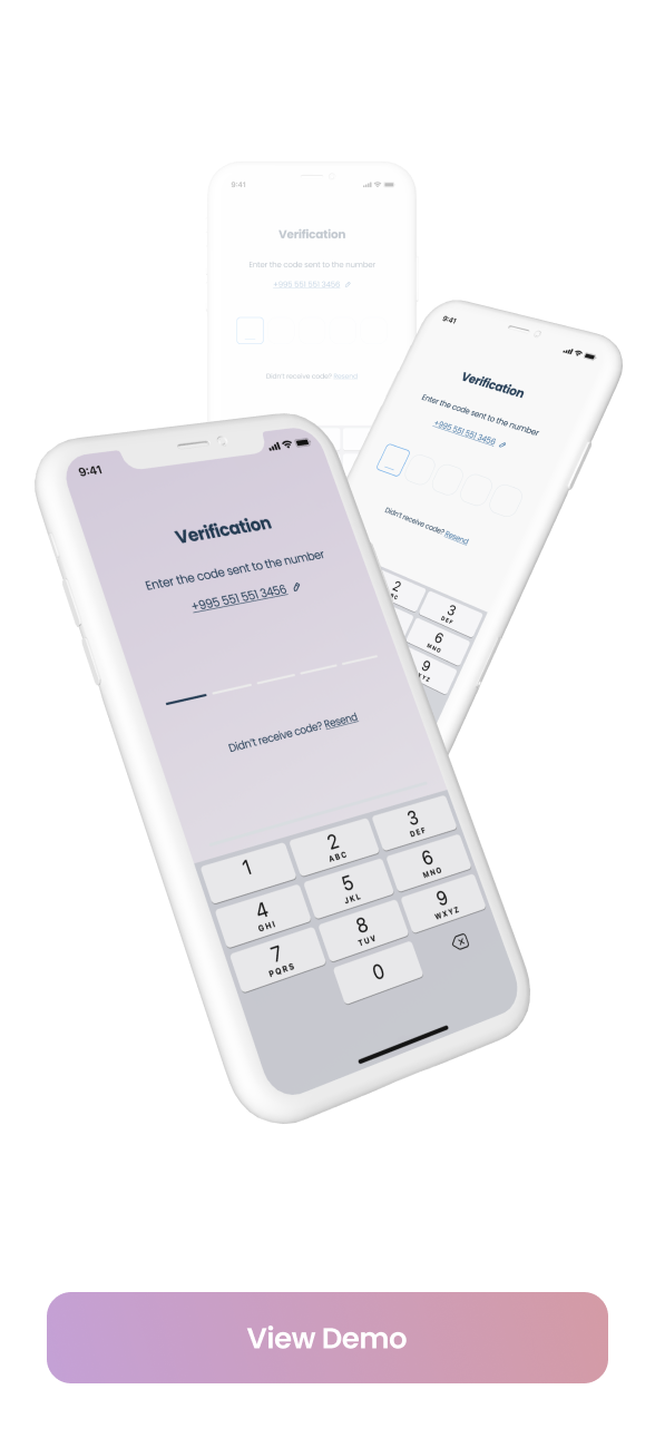
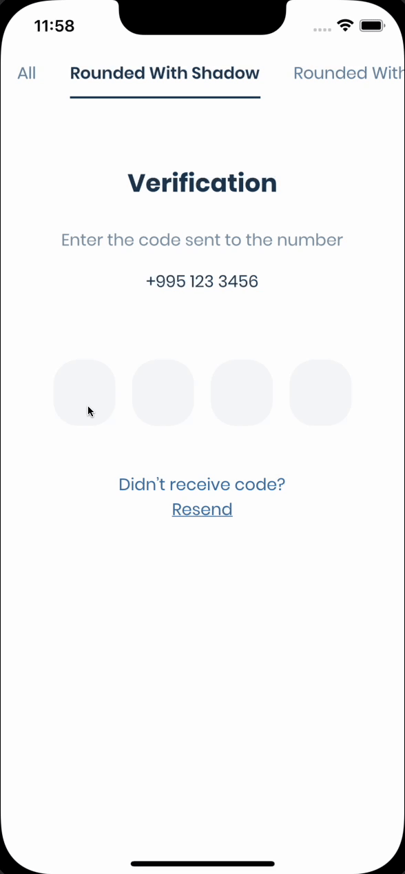
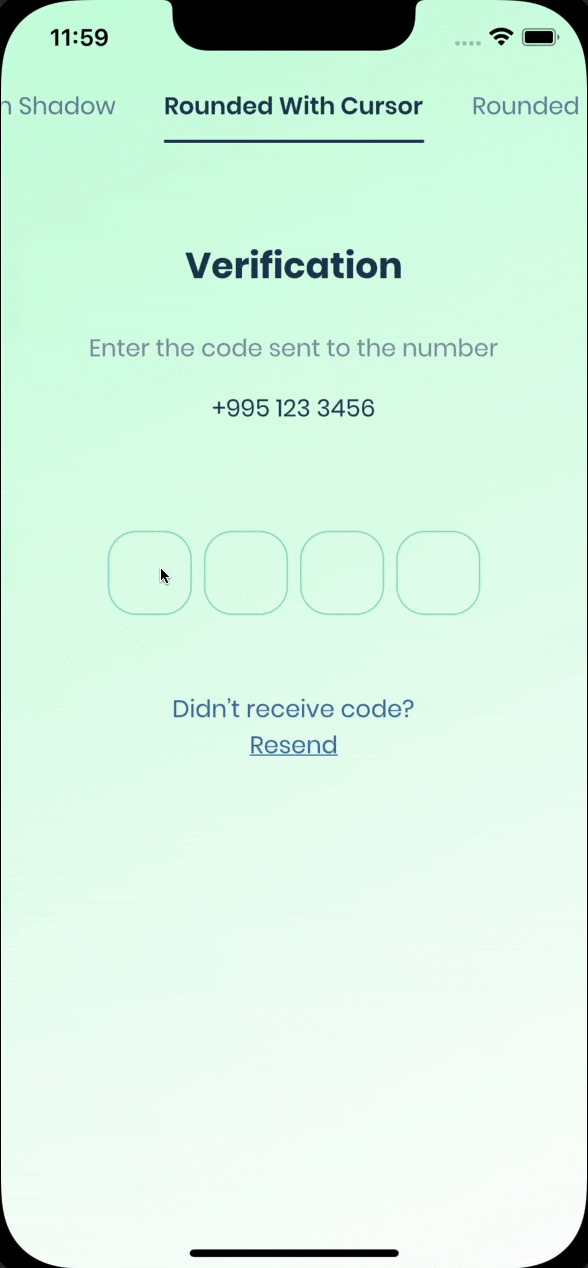
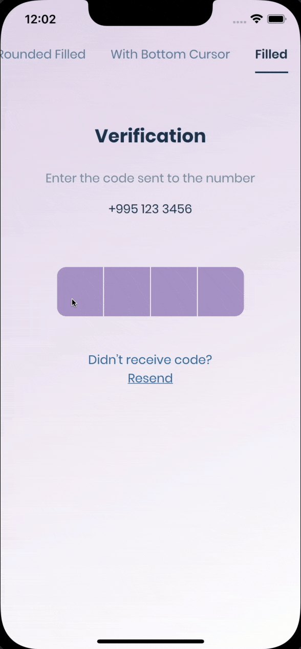
Demo #
| Live Demo | Rounded With Shadows | Rounded With Cursor |
|---|---|---|
 |
 |
 |
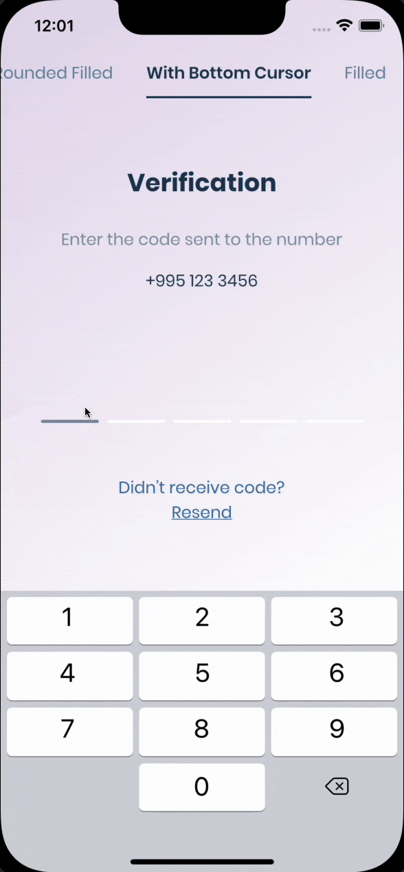
| Rounded Filled | With Bottom Cursor | Filled |
|---|---|---|
 |
 |
 |
Getting Started #
Pin has 6 state default focused, submitted, following, disabled, error, you can customize each state by specifying theme parameter.
Pin smoothly animates from one state to another automatically.
PinTheme Class
| Property | Default/Type |
|---|---|
| width | 56.0 |
| height | 60.0 |
| textStyle | TextStyle() |
| margin | EdgeInsetsGeometry |
| padding | EdgeInsetsGeometry |
| constraints | BoxConstraints |
You can use standard Pinput like so
  Widget buildPinPut() {
    return Pinput(
      onCompleted: (pin) => print(pin),
    );
  }
If you want to customize it, create defaultPinTheme first.
    final defaultPinTheme = PinTheme(
      width: 56,
      height: 56,
      textStyle: TextStyle(fontSize: 20, color: Color.fromRGBO(30, 60, 87, 1), fontWeight: FontWeight.w600),
      decoration: BoxDecoration(
        border: Border.all(color: Color.fromRGBO(234, 239, 243, 1)),
        borderRadius: BorderRadius.circular(20),
      ),
    );
if you want all pins to be the same don't pass other theme parameters,
If not, create focusedPinTheme, submittedPinTheme, followingPinTheme, errorPinTheme from defaultPinTheme
    final focusedPinTheme = defaultPinTheme.copyDecorationWith(
      border: Border.all(color: Color.fromRGBO(114, 178, 238, 1)),
      borderRadius: BorderRadius.circular(8),
    );

    final submittedPinTheme = defaultPinTheme.copyWith(
      decoration: defaultPinTheme.decoration.copyWith(
        color: Color.fromRGBO(234, 239, 243, 1),
      ),
    );
Put everything together
    final defaultPinTheme = PinTheme(
      width: 56,
      height: 56,
      textStyle: TextStyle(fontSize: 20, color: Color.fromRGBO(30, 60, 87, 1), fontWeight: FontWeight.w600),
      decoration: BoxDecoration(
        border: Border.all(color: Color.fromRGBO(234, 239, 243, 1)),
        borderRadius: BorderRadius.circular(20),
      ),
    );

    final focusedPinTheme = defaultPinTheme.copyDecorationWith(
      border: Border.all(color: Color.fromRGBO(114, 178, 238, 1)),
      borderRadius: BorderRadius.circular(8),
    );

    final submittedPinTheme = defaultPinTheme.copyWith(
      decoration: defaultPinTheme.decoration.copyWith(
        color: Color.fromRGBO(234, 239, 243, 1),
      ),
    );

    return Pinput(
      defaultPinTheme: defaultPinTheme,
      focusedPinTheme: focusedPinTheme,
      submittedPinTheme: submittedPinTheme,
      validator: (s) {
        return s == '2222' ? null : 'Pin is incorrect';
      },
      pinputAutovalidateMode: PinputAutovalidateMode.onSubmit,
      showCursor: true,
      onCompleted: (pin) => print(pin),
    );
See Example app for more Pinput examples Examples #
Tips #
-
Controller
    /// Create Controller
    final pinController = TextEditingController();

    /// Set text programmatically
    pinController.setText('1222');

    /// Append typed character, useful if you are using custom keyboard
    pinController.append('1', 4);

    /// Delete last character
    pinController.delete();

    /// Don't call setText, append, delete in build method, this is just illustration.

    return Pinput(
      controller: pinController,
    );
-
Focus
    /// Create FocusNode
    final pinputFocusNode = FocusNode();

    /// Focus pinput
    pinputFocusNode.requestFocus();

    /// UnFocus pinput
    pinputFocusNode.unfocus();

    /// Don't call requestFocus, unfocus in build method, this is just illustration.

    return Pinput(
      focusNode: pinputFocusNode,
    );
-
Validation
    /// Create key
    final formKey = GlobalKey<FormState>();

    /// Validate manually
    /// Don't call validate in build method, this is just illustration.
    formKey.currentState!.validate();

    return Form(
      key: formKey,
      child: Pinput(
        /// Auto validate after user tap on keyboard done button, or completes Pinput
        pinputAutovalidateMode: PinputAutovalidateMode.onSubmit,
        validator: (pin) {
          if (pin == '2224') return null;
          return 'Pin is incorrect';
        },
      ),
    );
Properties #
  /// Theme of the pin in default state
  final PinTheme? defaultPinTheme;

  /// Theme of the pin in focused state
  final PinTheme? focusedPinTheme;

  /// Theme of the pin in submitted state
  final PinTheme? submittedPinTheme;

  /// Theme of the pin in following state
  final PinTheme? followingPinTheme;

  /// Theme of the pin in disabled state
  final PinTheme? disabledPinTheme;

  /// Theme of the pin in error state
  final PinTheme? errorPinTheme;

  /// If true keyboard will be closed
  final bool closeKeyboardWhenCompleted;

  /// Displayed fields count. PIN code length.
  final int length;

  /// Fires when user completes pin input
  final ValueChanged<String>? onCompleted;

  /// Called every time input value changes.
  final ValueChanged<String>? onChanged;

  /// See [EditableText.onSubmitted]
  final ValueChanged<String>? onSubmitted;

  /// Called when user clicks on PinPut
  final VoidCallback? onTap;

  /// In order to catch event [enableInteractiveSelection] should be false
  final VoidCallback? onLongPress;

  /// Used to get, modify PinPut value and more.
  /// Don't forget to dispose controller
  /// ``` dart
  ///   @override
  ///   void dispose() {
  ///     controller.dispose();
  ///     super.dispose();
  ///   }
  /// ```
  final TextEditingController? controller;

  /// Defines the keyboard focus for this
  /// To give the keyboard focus to this widget, provide a [focusNode] and then
  /// use the current [FocusScope] to request the focus:
  /// Don't forget to dispose focusNode
  /// ``` dart
  ///   @override
  ///   void dispose() {
  ///     focusNode.dispose();
  ///     super.dispose();
  ///   }
  /// ```
  final FocusNode? focusNode;

  /// Widget that is displayed before field submitted.
  final Widget? preFilledWidget;

  /// Sets the positions where the separator should be shown
  final List<int>? separatorPositions;

  /// Builds a Pinput separator
  final Widget? separator;

  /// Defines how [Pinput] fields are being placed inside [Row]
  final MainAxisAlignment mainAxisAlignment;

  /// Defines how each [Pinput] field are being placed within the container
  final AlignmentGeometry pinContentAlignment;

  /// curve of every [Pinput] Animation
  final Curve animationCurve;

  /// Duration of every [Pinput] Animation
  final Duration animationDuration;

  /// Animation Type of each [Pinput] field
  /// options:
  /// none, scale, fade, slide, rotation
  final PinAnimationType pinAnimationType;

  /// Begin Offset of ever [Pinput] field when [pinAnimationType] is slide
  final Offset? slideTransitionBeginOffset;

  /// Defines [Pinput] state
  final bool enabled;

  /// See [EditableText.readOnly]
  final bool readOnly;

  /// See [EditableText.autofocus]
  final bool autofocus;

  /// Whether to use Native keyboard or custom one
  /// when flag is set to false [Pinput] wont be focusable anymore
  /// so you should set value of [Pinput]'s [TextEditingController] programmatically
  final bool useNativeKeyboard;

  /// If true, paste button will appear on longPress event
  final bool toolbarEnabled;

  /// Whether show cursor or not
  /// Default cursor '|' or [cursor]
  final bool showCursor;

  /// If [showCursor] true the focused field will show passed Widget
  final Widget? cursor;

  /// The appearance of the keyboard.
  /// This setting is only honored on iOS devices.
  /// If unset, defaults to [ThemeData.brightness].
  final Brightness? keyboardAppearance;

  /// See [EditableText.inputFormatters]
  final List<TextInputFormatter> inputFormatters;

  /// See [EditableText.keyboardType]
  final TextInputType keyboardType;

  /// Provide any symbol to obscure each [Pinput] pin
  /// Recommended ●
  final String obscuringCharacter;

  /// IF [obscureText] is true typed text will be replaced with passed Widget
  final Widget? obscuringWidget;

  /// Whether hide typed pin or not
  final bool obscureText;

  /// See [EditableText.textCapitalization]
  final TextCapitalization textCapitalization;

  /// The type of action button to use for the keyboard.
  ///
  /// Defaults to [TextInputAction.newline] if [keyboardType] is
  /// [TextInputType.multiline] and [TextInputAction.done] otherwise.
  final TextInputAction? textInputAction;

  /// Configuration of toolbar options.
  ///
  /// If not set, select all and paste will default to be enabled. Copy and cut
  /// will be disabled if [obscureText] is true. If [readOnly] is true,
  /// paste and cut will be disabled regardless.
  final ToolbarOptions toolbarOptions;

  /// See [EditableText.autofillHints]
  final Iterable<String>? autofillHints;

  /// See [EditableText.enableSuggestions]
  final bool enableSuggestions;

  /// See [EditableText.selectionControls]
  final TextSelectionControls? selectionControls;

  /// See [TextField.restorationId]
  final String? restorationId;

  /// Fires when clipboard has text of Pinput's length
  final ValueChanged<String>? onClipboardFound;

  /// Use haptic feedback everytime user types on keyboard
  /// See more details in [HapticFeedback]
  final HapticFeedbackType hapticFeedbackType;

  /// See [EditableText.onAppPrivateCommand]
  final AppPrivateCommandCallback? onAppPrivateCommand;

  /// See [EditableText.mouseCursor]
  final MouseCursor? mouseCursor;

  /// Style of error text
  final TextStyle? errorTextStyle;

  /// If [showError] is true and [errorBuilder] is passed it will be rendered under the Pinput
  final PinputErrorBuilder? errorBuilder;

  /// Return null if pin is valid or any String otherwise
  final FormFieldValidator<String>? validator;

  /// Return null if pin is valid or any String otherwise
  final PinputAutovalidateMode pinputAutovalidateMode;
Metadata
Publisher
Metadata
Pin code input (OTP) text field, Supports custom numpad. One Time Code,Password,Passcode,Captcha,Security,Coupon,Wowcher,2FA,Two step verification,two-factor authentication
Repository (GitHub)
View/report issues
License
 unknown (LICENSE)