pinput 2.0.4  pinput: ^2.0.4 copied to clipboard
 fman.ge
Pin code input (OTP) text field, Supports custom numpad. Password,Passcode,Captcha,Security,Coupon,Wowcher,2FA,Two step verification,two-factor authentication
Flutter Pinput From Tornike

Flutter package to create easily customizable Pin code input field (OTP) with slick animations. Please see the Changelog if you are using the old version (below 2.0.0)
Features: #
- Animated Decoration Switching
- Form validation
- iOS SMS Autofill
- Android Autofill, requires further implementation, use any packages listed below
- Standard Cursor
- Custom Cursor
- Cursor Animation
- Copy From Clipboard
- Ready For Custom Keyboard
- Standard Paste option
- Obscuring Character
- Obscuring Widget
- Haptic Feedback
- Close Keyboard After Completion
- Beautiful Examples
Support #
PRs Welcome
Discord Channel
Examples app on github has multiple templates to choose from
Don't forget to give it a star ⭐
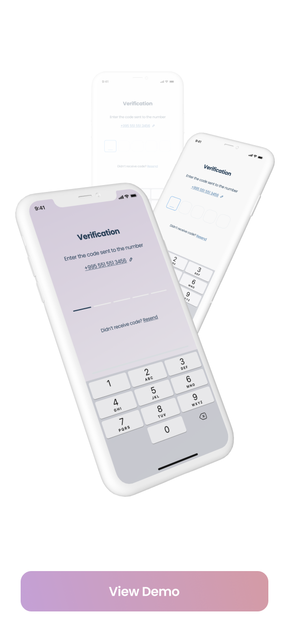
Demo #
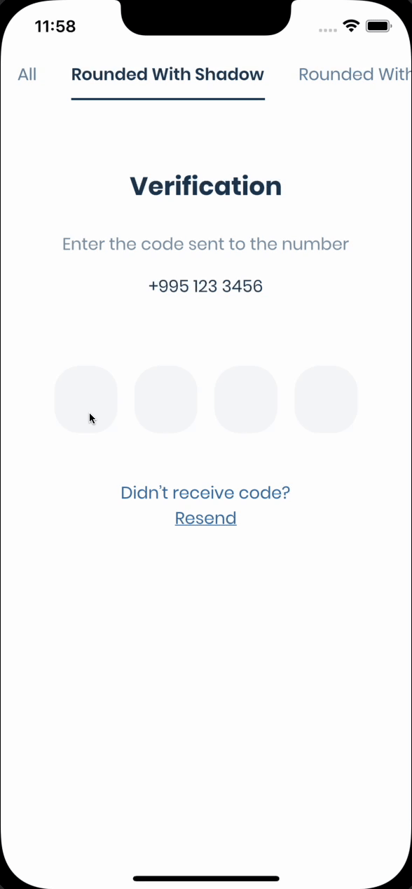
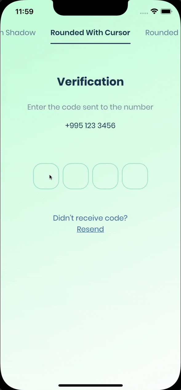
| Live Demo | Rounded With Shadows | Rounded With Cursor |
|---|---|---|
 |
 |
 |
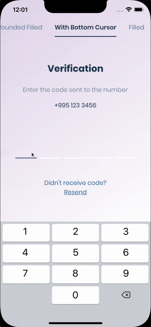
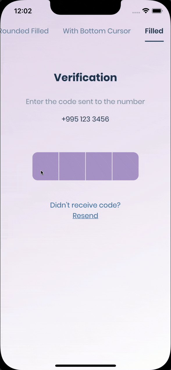
| Rounded Filled | With Bottom Cursor | Filled |
|---|---|---|
 |
 |
 |
Getting Started #
Pin has 6 state default focused, submitted, following, disabled, error, you can customize each state by specifying theme parameter.
Pin smoothly animates from one state to another automatically.
PinTheme Class
| Property | Default/Type |
|---|---|
| width | 56.0 |
| height | 60.0 |
| textStyle | TextStyle() |
| margin | EdgeInsetsGeometry |
| padding | EdgeInsetsGeometry |
| constraints | BoxConstraints |
You can use standard Pinput like so
  Widget buildPinPut() {
    return Pinput(
      onCompleted: (pin) => print(pin),
    );
  }
If you want to customize it, start creating defaultPinTheme first.
    final defaultPinTheme = PinTheme(
      width: 56,
      height: 56,
      textStyle: TextStyle(fontSize: 20, color: Color.fromRGBO(30, 60, 87, 1), fontWeight: FontWeight.w600),
      decoration: BoxDecoration(
        border: Border.all(color: Color.fromRGBO(234, 239, 243, 1)),
        borderRadius: BorderRadius.circular(20),
      ),
    );
if you want all pins to be the same don't pass other theme parameters,
If not, create focusedPinTheme, submittedPinTheme, followingPinTheme, errorPinTheme from defaultPinTheme
    final focusedPinTheme = defaultPinTheme.copyDecorationWith(
      border: Border.all(color: Color.fromRGBO(114, 178, 238, 1)),
      borderRadius: BorderRadius.circular(8),
    );

    final submittedPinTheme = defaultPinTheme.copyWith(
      decoration: defaultPinTheme.decoration.copyWith(
        color: Color.fromRGBO(234, 239, 243, 1),
      ),
    );
Put everything together
    final defaultPinTheme = PinTheme(
      width: 56,
      height: 56,
      textStyle: TextStyle(fontSize: 20, color: Color.fromRGBO(30, 60, 87, 1), fontWeight: FontWeight.w600),
      decoration: BoxDecoration(
        border: Border.all(color: Color.fromRGBO(234, 239, 243, 1)),
        borderRadius: BorderRadius.circular(20),
      ),
    );

    final focusedPinTheme = defaultPinTheme.copyDecorationWith(
      border: Border.all(color: Color.fromRGBO(114, 178, 238, 1)),
      borderRadius: BorderRadius.circular(8),
    );

    final submittedPinTheme = defaultPinTheme.copyWith(
      decoration: defaultPinTheme.decoration.copyWith(
        color: Color.fromRGBO(234, 239, 243, 1),
      ),
    );

    return Pinput(
      defaultPinTheme: defaultPinTheme,
      focusedPinTheme: focusedPinTheme,
      submittedPinTheme: submittedPinTheme,
      showCursor: true,
      onCompleted: (pin) => print(pin),
    );
See Example app for more Pinput examples Examples #
Properties #
 /// Theme of the pin in default state
  final PinTheme? defaultPinTheme;

  /// Theme of the pin in focused state
  final PinTheme? focusedPinTheme;

  /// Theme of the pin in submitted state
  final PinTheme? submittedPinTheme;

  /// Theme of the pin in following state
  final PinTheme? followingPinTheme;

  /// Theme of the pin in disabled state
  final PinTheme? disabledPinTheme;

  /// Theme of the pin in error state
  final PinTheme? errorPinTheme;

  ///
  final bool closeKeyboardWhenCompleted;

  /// See [TextField.textDirection]
  final TextDirection? textDirection;

  /// Displayed fields count. PIN code length.
  final int length;

  /// Fires when user completes pin input
  final ValueChanged<String>? onCompleted;

  /// Signature for being notified when a form field changes value.
  final FormFieldSetter<String>? onSaved;

  /// Called every time input value changes.
  final ValueChanged<String>? onChanged;

  /// Called when user clicks on PinPut
  final VoidCallback? onTap;

  /// In order to catch event [enableInteractiveSelection] should be false
  final VoidCallback? onLongPress;

  /// Used to get, modify PinPut value and more.
  final TextEditingController? controller;

  /// Defines the keyboard focus for this
  /// To give the keyboard focus to this widget, provide a [focusNode] and then
  /// use the current [FocusScope] to request the focus:
  final FocusNode? focusNode;

  /// Widget that is displayed before field submitted.
  final Widget? preFilledWidget;

  /// Sets the positions where the separator should be shown
  final List<int>? separatorPositions;

  /// Builds a Pinput separator
  final Widget? separator;

  /// Defines how [Pinput] fields are being placed inside [Row]
  final MainAxisAlignment mainAxisAlignment;

  /// Defines how each [Pinput] field are being placed within the container
  final AlignmentGeometry pinContentAlignment;

  /// curve of every [Pinput] Animation
  final Curve animationCurve;

  /// Duration of every [Pinput] Animation
  final Duration animationDuration;

  /// Animation Type of each [Pinput] field
  /// options:
  /// none, scale, fade, slide, rotation
  final PinAnimationType pinAnimationType;

  /// Begin Offset of ever [Pinput] field when [pinAnimationType] is slide
  final Offset? slideTransitionBeginOffset;

  /// Defines [Pinput] state
  final bool enabled;

  /// {@macro flutter.widgets.editableText.autofocus}
  final bool autofocus;

  /// Whether we use Native keyboard or custom `Numpad`
  /// when flag is set to false [Pinput] wont be focusable anymore
  /// so you should set value of [Pinput]'s [TextEditingController] programmatically
  final bool useNativeKeyboard;

  /// See [TextField.enableInteractiveSelection]
  final bool enableInteractiveSelection;

  /// If true the [errorPinTheme] will be applied
  final bool showError;

  /// Whether show cursor or not
  /// Default cursor '|' or [cursor]
  final bool showCursor;

  /// If [showCursor] true the focused field will show passed Widget
  final Widget? cursor;

  /// The appearance of the keyboard.
  /// This setting is only honored on iOS devices.
  /// If unset, defaults to [ThemeData.brightness].
  final Brightness? keyboardAppearance;

  /// See [TextField.inputFormatters]
  final List<TextInputFormatter>? inputFormatters;

  /// See [TextField.keyboardType]
  final TextInputType keyboardType;

  /// Provide any symbol to obscure each [Pinput] pin
  /// Recommended ●
  final String obscuringCharacter;

  /// IF [obscureText] is true typed text will be replaced with passed Widget
  final Widget? obscuringWidget;

  /// Whether hide typed pin or not
  final bool obscureText;

  /// See [TextField.textCapitalization]
  final TextCapitalization textCapitalization;

  /// The type of action button to use for the keyboard.
  ///
  /// Defaults to [TextInputAction.newline] if [keyboardType] is
  /// [TextInputType.multiline] and [TextInputAction.done] otherwise.
  final TextInputAction? textInputAction;

  /// Configuration of toolbar options.
  ///
  /// If not set, select all and paste will default to be enabled. Copy and cut
  /// will be disabled if [obscureText] is true. If [readOnly] is true,
  /// paste and cut will be disabled regardless.
  final ToolbarOptions? toolbarOptions;

  /// See [TextField.autofillHints]
  final Iterable<String>? autofillHints;

  /// See [TextField.enableSuggestions]
  final bool enableSuggestions;

  /// See [TextField.onEditingComplete]
  final VoidCallback? onEditingComplete;

  /// See [TextField.onSubmitted]
  final ValueChanged<String>? onSubmitted;

  /// See [TextField.selectionControls]
  final TextSelectionControls? selectionControls;

  /// See [TextField.restorationId]
  final String? restorationId;

  /// See [TextField.enableIMEPersonalizedLearning]
  final bool enableIMEPersonalizedLearning;

  /// Fires when clipboard has text of Pinput's length
  final ValueChanged<String>? onClipboardFound;

  /// Use haptic feedback everytime user types on keyboard
  /// See more details in [HapticFeedback]
  final HapticFeedbackType hapticFeedbackType;
Metadata
Publisher
Metadata
Pin code input (OTP) text field, Supports custom numpad. Password,Passcode,Captcha,Security,Coupon,Wowcher,2FA,Two step verification,two-factor authentication
Repository (GitHub)
View/report issues
License
 unknown (LICENSE)