motion_toast 2.2.0  motion_toast: ^2.2.0 copied to clipboard
 badrkouki.dev
A beautiful designed toast with animations, contains multiple built in designs and let you design your toast
Motion Toast #

A new well designed toast with animations and multiple built-in types
 |
 |
|---|---|
 |
 |
 |
 |
Features #
- Animated toasts with animated icons
- Built-in types (Success, Warning, Error, Info, Delete)
- Possibility to design your own toast
- Different color themes (mutliple colors support)
- Support null safety
- Heartbeat animations
- Full customized text
- Built in animations
- Customize toast layout (LTR/RTL)
- Customize toast duration
- Customize Motion toast position (Center, Bottom, Top)
- Support long text
- Background style customization
- Display simultaneous toasts
- Customizable barrier color
- Enable dismiss when toast is displayed (top, center, bottom)
Getting Started #
In order to add motion toast to your project add this line to your pubspec.yaml file
dependencies:
	motion_toast: ^2.2.0
Or you can reference the main repository directly by adding those lines
dependencies:
	motion_toast:
		git: https://github.com/koukibadr/Motion-Toast.git
Attributes #
| Name | Type | Description | Required | Default Value |
|---|---|---|---|---|
| description | Text |
The description text | true | N/A |
| title | Text |
The toast title | false | empty string |
| icon | IconData |
The toast icon | required when creating a custom toast otherwise you don't have to pass it | N/A |
| primaryColor | Color |
The motion toast background color (applied on the background) | required when creating a custom toast otherwise you don't have to pass it | N/A |
| width | double |
The motion toast width | false | 350 |
| height | double |
The motion toast height | false | 80 |
| iconSize | double |
The icon size | false | 40 |
| iconType | ICON_TYPE String |
The design type of the icon (Material design or Cupertino) values: ICON_TYPE.MATERIAL_DESIGN or ICON_TYPE.CUPERTINO |
false | ICON_TYPE.MATERIAL_DESIGN |
| enableAnimation | boolean |
Whether enable or disable the animation applied on the icon (heartbeat animation) | false | true |
| layoutOrientation | ORIENTATION |
the layout orientation of the toast (from left to right LTR or from right to left RTL | false | ORIENTATION.LTR |
| animationType | ANIMATION |
the toast enter animation | false | ANIMATION.FROM_BOTTOM |
| animationDuration | Duration |
the animation duration | false | Duration(milliseconds: 1500) |
| toastDuration | Duration |
How much the toast will be shown | false | Duration(seconds: 3) |
| animationCurve | Curves |
The toast animation curve | false | Curves.ease |
| position | MOTION_TOAST_POSITION |
The position where the toast will be displayed (TOP, BOTTOM, CENTER) | false | MOTION_TOAST_POSITION.BOTTOM |
| borderRadius | double |
define the radius of the toast | false | 20 |
| onClose | Function |
function invoked once the toast in closed | false | null |
| dismissable | bool |
define whether the toast can be dismissed or not (applied only on bottom motion taost) | false | true |
| secondaryColor | Color |
Secondary color applied on the sidebar and the icon (available when using the default constructor) | false | null |
| backgroundType | BACKGROUND_TYPE |
define the background style transparent, solid or lighter | false | BACKGROUND_TYPE.lighter |
| barrierColor | Color |
the barrier color | false | Colors.transparent |
- When creating you custom toast you don't have to use
iconTypeit will not be used when rendering the toast - For bottom toast you can't set the animation
FROM_TOPas well as for top displayed toast you can't set the animation toFROM_BOTTOM - for center motion toast it will be rendered without animations
- if
secondaryColornot defined sidebar and icon will be rendered withprimaryColor
Implementation #
- Success Motion Toast
MotionToast.success(
	title:  Text("Success Motion Toast"),
	description:  Text("Example of success motion toast"),
	width:  300
).show(context);
- Warning Motion Toast
MotionToast.warning(
	title:  Text("Warning Motion Toast"),
	description:  Text("This is a Warning")
).show(context);
- Error Motion Toast
MotionToast.error(
	title:  Text("Error"),
	description:  Text("Please enter your name")
).show(context);
- Info Motion Toast
MotionToast.info(
	title:  Text("Info Motion Toast"),
	description:  Text("Example of Info Toast")
).show(context);
- Delete Motion Toast
MotionToast.delete(
	title:  Text("Deleted"),
	description:  Text("The item is deleted")
).show(context);
- Custom Motion Toast
To create your custom toast just use the default constructor,
icon description and color are required
MotionToast(
	icon: Icons.alarm,
	primaryColor: Colors.pink,
	title:  Text("Custom Toast"),
	description:  Text("You can customize the toast!"),
	width:  300
).show(context);
- Right-Designed Motion Toast
To change the toast layout you need to use layoutOrientation,
icon description and color are required
MotionToast.success(
	title:  Text("من اليمين"),
	description:  Text("هذا مثال بالعربية"),
	layoutOrientation: ORIENTATION.RTL,
	animationType: ANIMATION.FROM_RIGHT,width:  300,
).show(context);
- Top-displayed Motion Toast
To change the display position of the motion toast use position attribute
MotionToast(
	icon: Icons.zoom_out,
	color: Colors.deepOrange,
	title:  Text("Top Motion Toast"),
	description:  Text("Another motion toast example"),
	position: MOTION_TOAST_POSITION.TOP,
	animationType: ANIMATION.FROM_TOP,
).show(context);
- Center-displayed Motion Toast
MotionToast(
	icon: Icons.zoom_out,
	color: Colors.deepOrange,
	title:  Text("Center Motion Toast"),
	description:  Text("Another motion toast example"),
	position: MOTION_TOAST_POSITION.CENTER
).show(context);
- Using onClose parameter (display two successive toasts)
MotionToast.success(
	title:  Text("User Data"),
	description:  Text("Your data has been deleted"),
	onClose: (){
		MotionToast.error(
			title:  Text("User Data"),
			description:  Text("Your data has been deleted"),
		).show(context);
	},
).show(context);
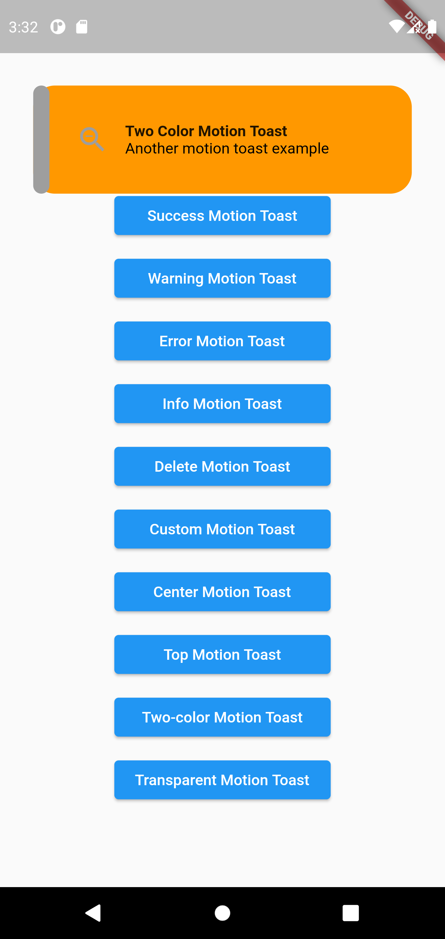
- Two-Colors Motion Toast
MotionToast(
	icon: Icons.zoom_out,
	primaryColor: Colors.orange[500]!,
	secondaryColor: Colors.grey,
	backgroundType: BACKGROUND_TYPE.solid,
	title:  Text('Two Color Motion Toast'),
	description:  Text('Another motion toast example'),
	position: MOTION_TOAST_POSITION.top,
	animationType: ANIMATION.fromTop,
	height:  100,
).show(context);
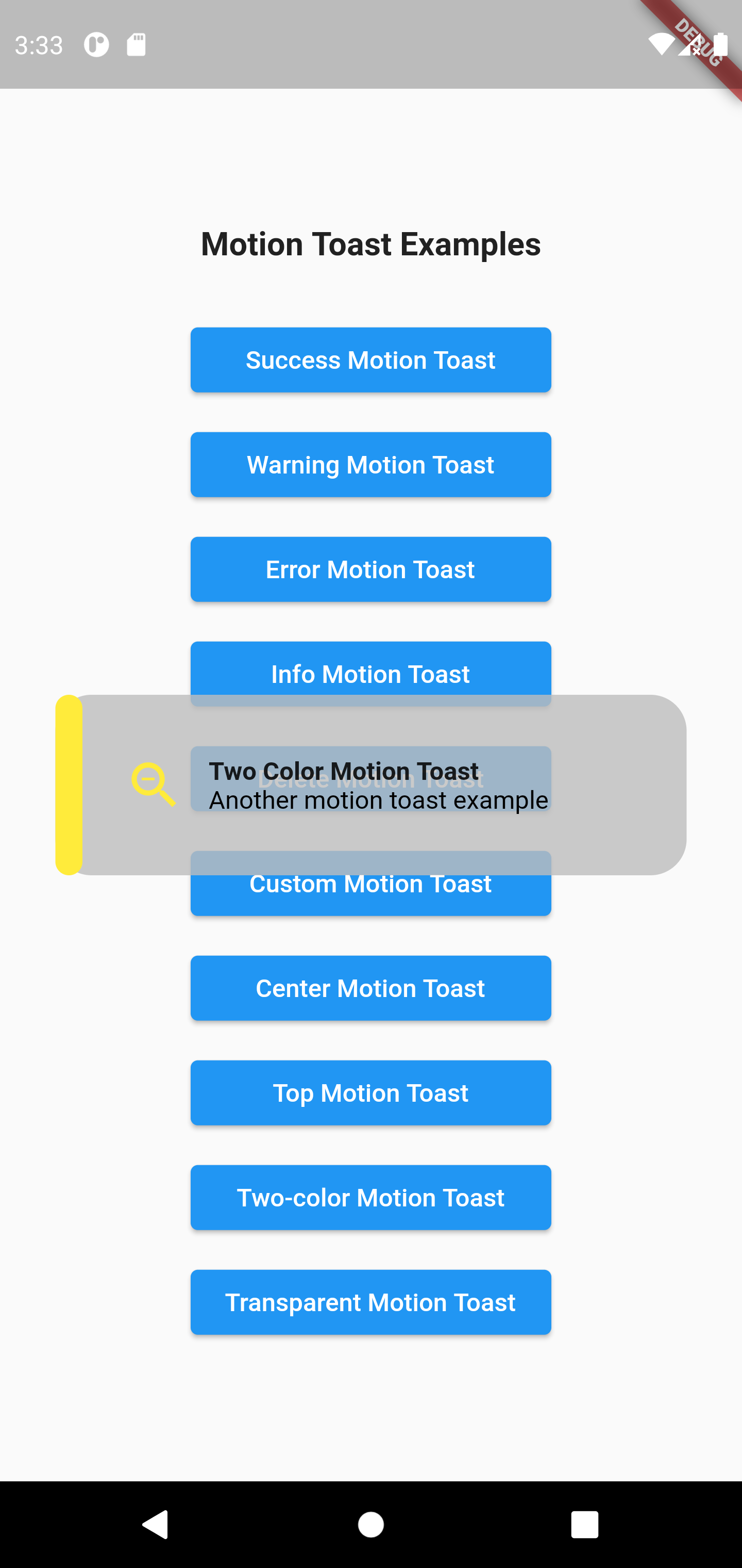
- Transparent background motion toast
MotionToast(
	icon: Icons.zoom_out,
	primaryColor: Colors.grey[400]!,
	secondaryColor: Colors.yellow,
	backgroundType: BACKGROUND_TYPE.transparent,
	title:  Text('Two Color Motion Toast'),
	description:  Text('Another motion toast example'),
	position: MOTION_TOAST_POSITION.center,
	height:  100,
).show(context);
Contribution #
Of course the project is open source, and you can contribute to it repository link
- If you found a bug, open an issue.
- If you have a feature request, open an issue.
- If you want to contribute, submit a pull request.
Support The Community #
If you like the package and want to support the dev team follow the donation link below. Thanks for your support!
Contributors #
Metadata
Publisher
Metadata
A beautiful designed toast with animations, contains multiple built in designs and let you design your toast
Repository (GitHub)
View/report issues
License
 unknown (LICENSE)