flutterflow_widgets 0.0.52  flutterflow_widgets: ^0.0.52 copied to clipboard
Easy to use custom widget & action library for the FlutterFlow deveopers.
FlutterFlow Widgets #
-
This package is developed for
FlutterFlow. And you may use in flutter. -
This package contains not only widgets but also some actions that are related with UI design like snackbar.
TextWithLabel #
- explain...
LinkifyText #
- This is a simple and handy widget to use display linkified and launchable text. When a user taps, it will open the url in the text. This is a simple combination of
linkifyandlauncherwidgets.
TODO #
- Change the widget name from
LinkTesttoLinkifyText.
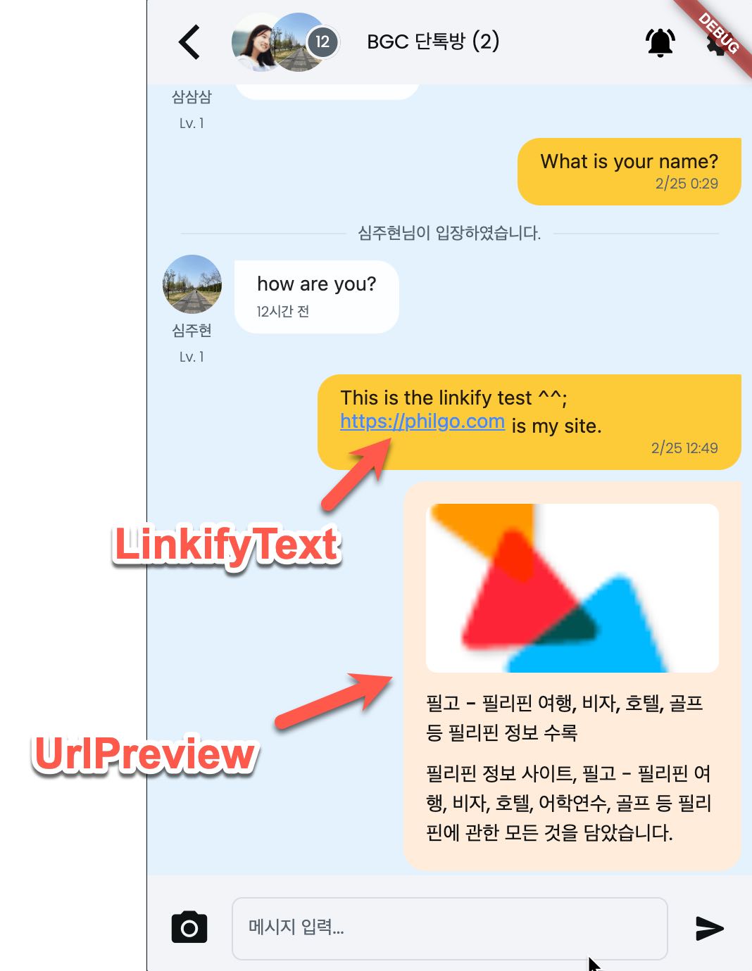
How to use LinkifyText #
- import
flutterflow_widgetspackage and supplytextproperty toLinkifyText. - It will open the link when the user taps on the link.
- Don't forget to uncheck
Enforce Width and Height.
import 'package:flutterflow_widgets/flutterflow_widgets.dart';

class Linkify extends StatefulWidget {
  const Linkify({
    Key? key,
    this.width,
    this.height,
    this.text,
  }) : super(key: key);

  final double? width;
  final double? height;
  final String? text;

  @override
  _LinkifyState createState() => _LinkifyState();
}

class _LinkifyState extends State<Linkify> {
  @override
  Widget build(BuildContext context) {
    return LinkifyText(
      text: widget.text ?? '',
      style: TextStyle(fontSize: 14),
    );
  }
}
UrlPreview #
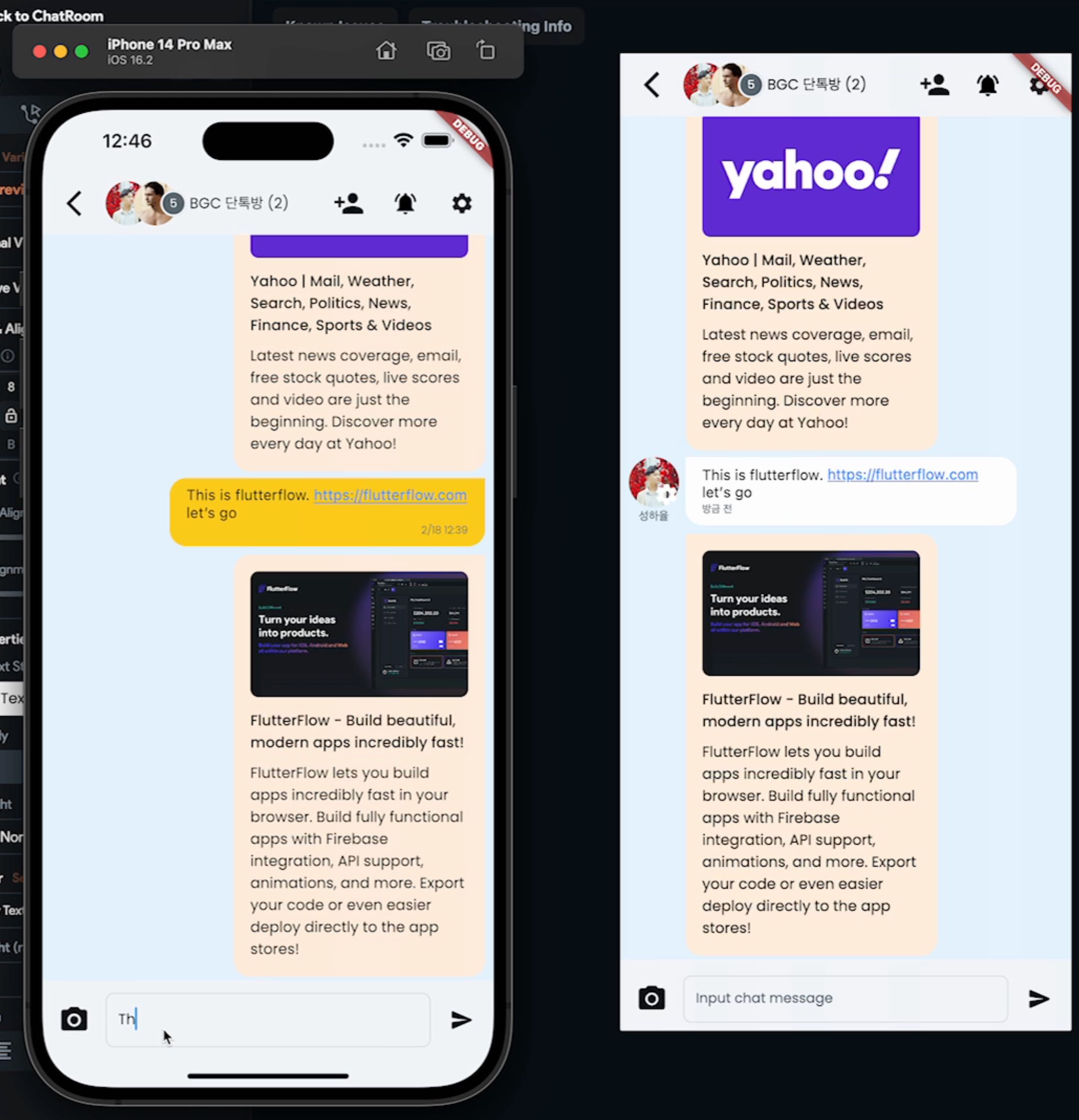
- When there is an URL in a text, then it will show a preview.
import 'package:flutterflow_widgets/flutterflow_widgets.dart';
UrlPreview(
  text: 'Stack overflow: https://stackoverflow.com/questions/62540297/figma-text-orientation?a=b&text-orien, This is naver https://naver.com.',
  descriptionLength: 80,
  builder: (child) => Container(
    margin: const EdgeInsets.only(top: 8),
    padding: const EdgeInsets.all(8),
    width: 240,
    decoration: BoxDecoration(
      color: Colors.amber.shade100,
      border: Border.all(color: Colors.black),
      borderRadius: BorderRadius.circular(8),
    ),
    child: child,
  ),
),
-
For more details, see the example at example/lib/url_preview.screen.dart
-
Here is another example for FlutterFlow. Just copy & paste the code below.
import 'package:flutterflow_widgets/flutterflow_widgets.dart';

class SitePreview extends StatefulWidget {
  const SitePreview({
    Key? key,
    this.width,
    this.height,
    this.text,
    this.padding,
    this.descriptionLength,
    required this.myMessage,
  }) : super(key: key);

  final double? width;
  final double? height;
  final String? text;
  final double? padding;
  final int? descriptionLength;
  final bool myMessage;

  @override
  createState() => SitePreviewState();
}

class SitePreviewState extends State<SitePreview> {
  @override
  Widget build(BuildContext context) {
    return UrlPreview(
      text: widget.text,
      descriptionLength: widget.descriptionLength,
      builder: (Widget child) => Container(
        margin: const EdgeInsets.only(top: 8),
        padding: const EdgeInsets.all(16),
        width: 260,
        decoration: BoxDecoration(
            color: Colors.amber.shade50.withAlpha(100),
            border: Border.all(color: Colors.black26.withAlpha(25)),
            borderRadius: BorderRadius.only(
              topLeft: Radius.circular(widget.myMessage == false ? 0 : 16),
              topRight: Radius.circular(widget.myMessage ? 0 : 16),
              bottomLeft: Radius.circular(16),
              bottomRight: Radius.circular(16),
            )),
        child: child,
      ),
    );
  }
}
Custom Popup widget. #
Flutterflow provides the bottom sheet widget. But it is a bit different from the popup menu.
So, I made a widget named CustomPopup that does something like the popup menu in the following screenshot.
In the screenshot, I display the members of the chat room. Yes, it is a real popup menu and all the designs are coming from Components. You can add custom design and actions as you want.
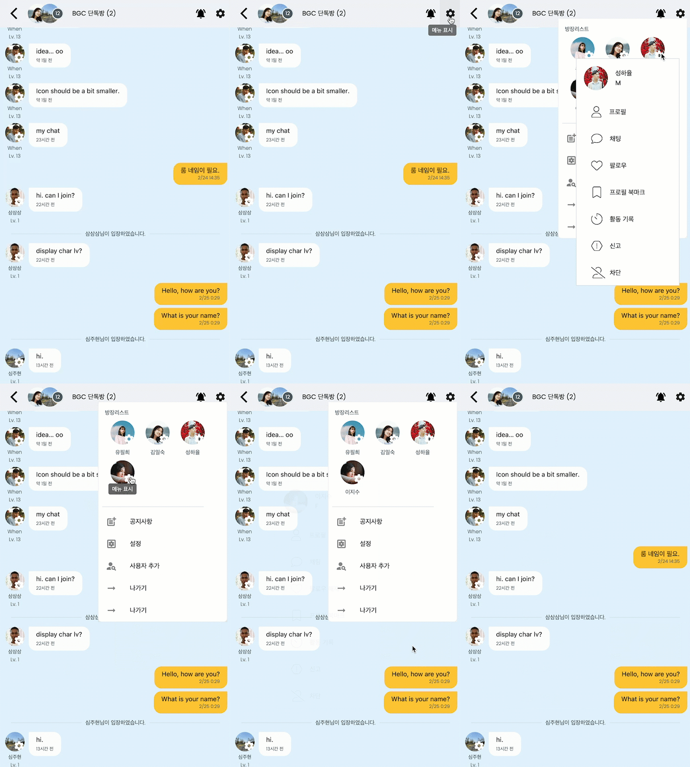
It would be good to use when there are multiple popup menus in one screen. Like one in left side of appbar, and another in right side of app bar, and one more on user profile photo of each posts and comments.
Custom Popup Tips #
-
When you want to display dynamic content in the popup box, you would set the width and height bound on the popup box. Or you would see an error of
NEEDS-LAYOUT NEEDS-PAINT. -
To change the state of popup, you need to make it with a stream.
How to implement the custom ppup #
-
For your information, When you create a Component, you can use that Component in a Custom widget. You need to check
Exclude from Compilein this case. -
The child widget is the Component that displays as a trigger. The child component in the screenshot above is the widget that has two photos. In the component, the first user is the user who sent the last message. The second user is the user who last entered the chat room.
-
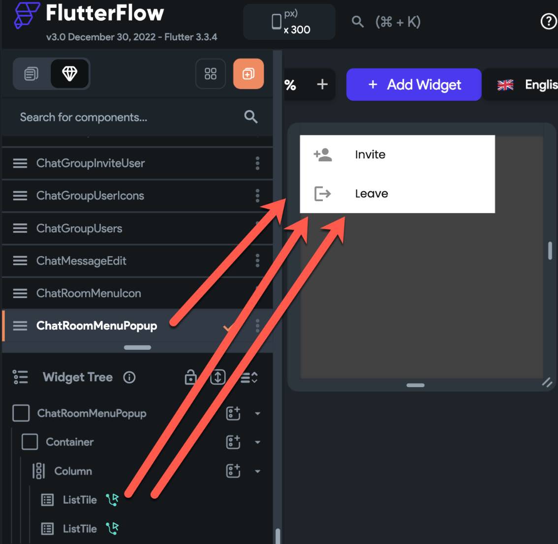
When a user taps on the Component, a popup menu is shown. And the popup menu is the ChatGroupUsers Component.
-
You can make your own child Component and the popup Component with your own design and actions. Just the way you develop your Component.
- And passed them over the CustomPopup widget.
-
Don't put the size of the width in the popup component. Or put it as
inf. The width of the popup component meant to be automatically sized by theCustomPopupwidget. See the popup component width size issue. -
Options
- dx is the x position where the popup would appear.
- dy is the y position where the popup would appear.
-
tooltipcan be used to display as the tooltip text when it is hovered. By default, it is an empty string and no tooltip appears.
import 'package:app/components/icon_component_widget.dart';
import 'package:app/components/popup_component_widget.dart';
import 'package:flutterflow_widgets/flutterflow_widgets.dart';

class PopupExample extends StatefulWidget {
 const PopupExample({
   Key? key,
   this.width,
   this.height,
 }) : super(key: key);

 final double? width;
 final double? height;

 @override
 _PopupExampleSate createState() => _PopupExampleSate();
}

class _PopupExampleSate extends State<PopupExample> {
 @override
 Widget build(BuildContext context) {
   return CustomPopup(
    tooltip: 'This is the tooltip',
     dx: 32,
     dy: 38,
     child: IconComponentWidget(),
     popup: PopupComponentWidget(),
   );
 }
}
- It can go much complicated customization like below.
- The custom widget
DisplayChatUsersbelow takes a parameter ofchatRoomand it passes over the child widget and popup widget. Then, the child and popup widget may display different information.
- The custom widget
import 'package:flutterflow_widgets/flutterflow_widgets.dart';
import '../../components/user_photo_popup_icon_widget.dart';
import '../../components/user_photo_popup_menu_widget.dart';

class UserPhoto extends StatefulWidget {
  const UserPhoto({
    Key? key,
    this.width,
    this.height,
    required this.userPublicDataDocument,
  }) : super(key: key);

  final double? width;
  final double? height;
  final UsersPublicDataRecord userPublicDataDocument;

  @override
  _UserPhotoState createState() => _UserPhotoState();
}

class _UserPhotoState extends State<UserPhoto> {
  @override
  Widget build(BuildContext context) {
    return CustomPopup(
      dx: 32,
      dy: 38,
      popup: UserPhotoPopupMenuWidget(
        userPublicDataDocument: widget.userPublicDataDocument,
      ),
      child: UserPhotoPopupIconWidget(
        userPublicDataDocument: widget.userPublicDataDocument,
        width: widget.width,
        height: widget.height,
      ),
    );
  }
}
- If you are showing only an icon for the popup menu button, then you won't need to create a custom component for that.
- Simply use Icon parameter
import '../../components/chat_room_menu_popup_widget.dart';

import 'package:flutterflow_widgets/flutterflow_widgets.dart';

class ChatRoomMenu extends StatefulWidget {
  const ChatRoomMenu({
    Key? key,
    this.width,
    this.height,
    required this.chatRoomDocument,
    required this.icon,
  }) : super(key: key);

  final double? width;
  final double? height;
  final ChatRoomsRecord chatRoomDocument;
  final Widget icon;

  @override
  _ChatRoomMenuState createState() => _ChatRoomMenuState();
}

class _ChatRoomMenuState extends State<ChatRoomMenu> {
  @override
  Widget build(BuildContext context) {
    return CustomPopup(
      dx: 0,
      dy: 32,
      child: widget.icon,
      popup: ChatRoomMenuPopupWidget(chatRoomDocument: widget.chatRoomDocument),
    );
  }
}
Custom popup step by step example #
Create a child Component #
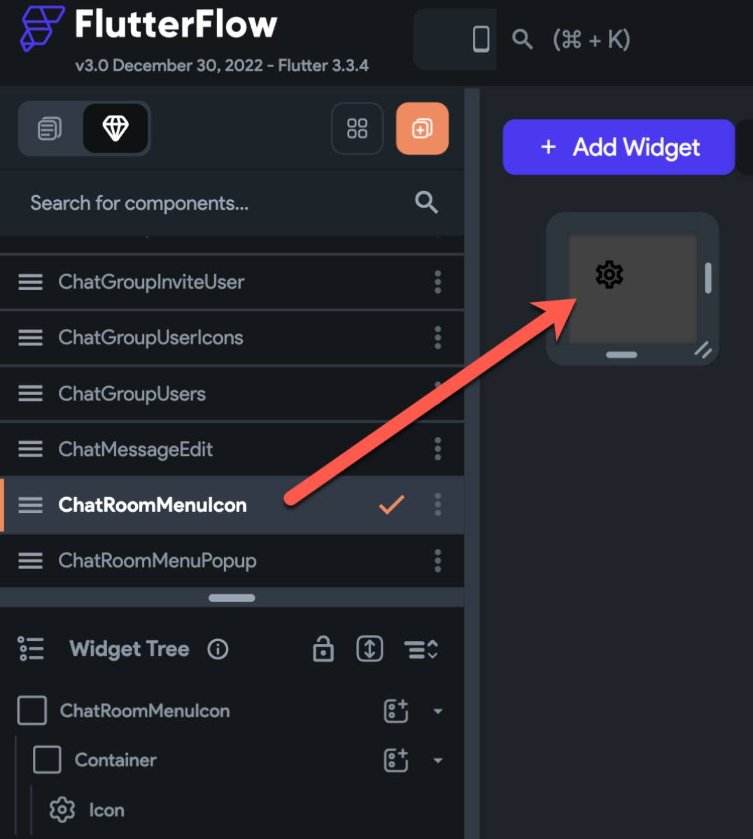
The child component is the widget that will trigger a popup menu to be appeared when a user presses on.
Example)
Just create an icon, or a text or any. You can do whatever design you like, but don’t put a widget that has tap event handler like a button.
Create a popup Component #
Create a component that will appear as a popup menu. You can do whatever design you want and you can add whatever actions you like. And yes, it works just as you expect.
Custom widget for Custom Popup #
- Create a custom widget to make the child Component and the popup Component work together
The difficult part may be creating the custom widget to make the two widgets work together.
I named the custom widget as ChatRoomMenu. So, the following code snippet contains ChatRoomMenu as its class name.
The see import statement. The patterns of the import path are
Add ../../components/ in front.
Then, add the kebab case of the Component.
Lastly, add _widget.dart.
You will need to import package:fireflow.fireflow.dart for fireflow.
And in the body of the state class, use CustomPopup with child and popup parameters with its respective Components.
And finally, on the Widget Settings.
I checked Exclude from compilation. This is needed when you refer to codes that are generated by FlutterFlow itself like accessing Components.
- Example
Pubspec Dependencies
flutterflow_widgets
import '../../components/chat_room_menu_icon_widget.dart';
import '../../components/chat_room_menu_popup_widget.dart';
import 'package:flutterflow_widgets/flutterflow_widgets.dart';

class ChatRoomMenu extends StatefulWidget {
  const chatRoomMenu({
    Key? key,
    this.width,
    this.height,
  }) : super( key: key );

  final double this.width;
  final double this.height;

  @override
  _ChatRoomMenuState createState() => _ChatRoomMenuState();
}

class _ChatRoomMenuState extends State<ChatRoomMenu> {
  @override
  Widget build(BuildContext context) {
    return CustomComponent(
      dx: 0,
      dy: 38,
      child: ChatRoomMenuIconWidget(),
      popup: ChatRoomMenuPopupWidget(),
    )
  }
}
Add the custom widget in your design #
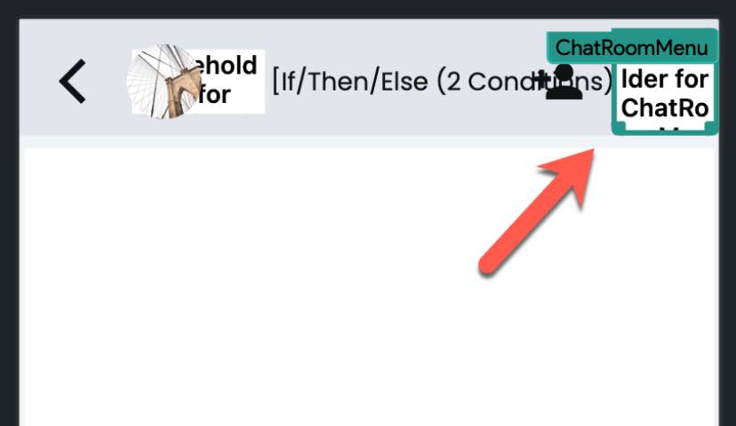
Now, the easiest part. Just add the custom widget where you want to add. For the example of the code above, the Custom widget is ChatRoomMenu. And I added at the top-right corner.
CustomIconPopup #
-
You can use
Iconinstead of adding a child component. -
Below are two example of how you can create a widget that uses
CustomIconPopup.
![]()
![]()
- You can code like below.
CustomIconPopup(
  popup: Container(
    color: Colors.blue,
    child: Column(
      mainAxisSize: MainAxisSize.min,
      children: [
        const Text('Custom Icon Popup '),
        const Text('Content of the popup'),
        const Text('Apple, Banana, Cherry'),
        const Text(''),
        const Text('Close'),
        TextButton.icon(
          onPressed: Navigator.of(context).pop,
          icon: const Icon(Icons.close),
          label: const Text(
            'Close',
            style: TextStyle(color: Colors.white),
          ),
        ),
      ],
    ),
  ),
  icon: const Icon(
    Icons.settings,
    size: 18,
  ),
  iconPadding: 16,
)
DisplayMedia widget #
This widget accepts a String of URL together with width and height.
The width and height are respected to size the DisplayMedia widget.
This widget displays any kind of url like photo, video, audio, txt, pdf, etc.
See the details on the API reference - MediaDisplay.
Below is an example of displaying media by giving a photo url.
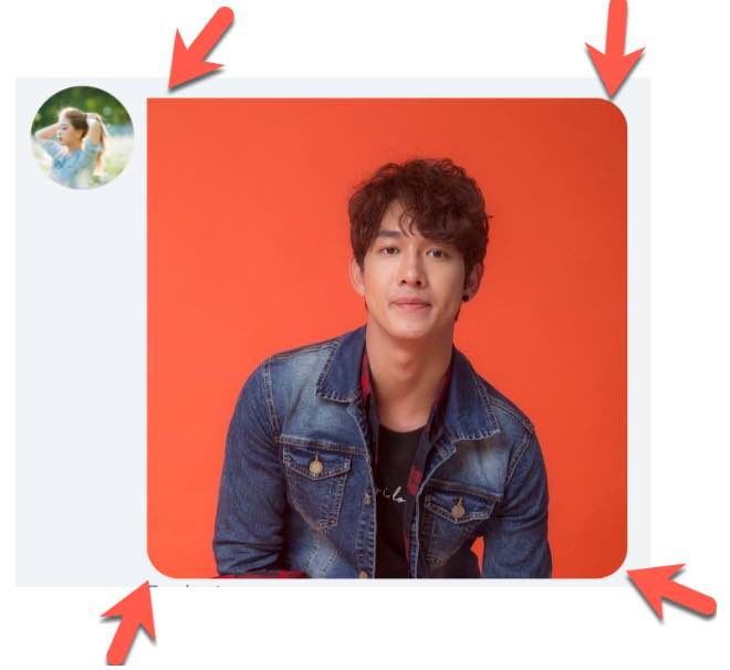
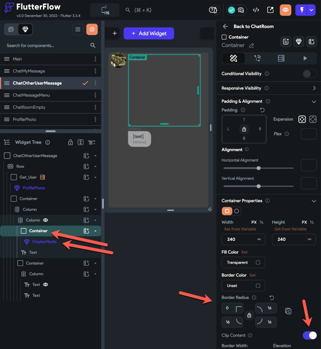
To make the border round like above,
Disable Enforce Width and Height
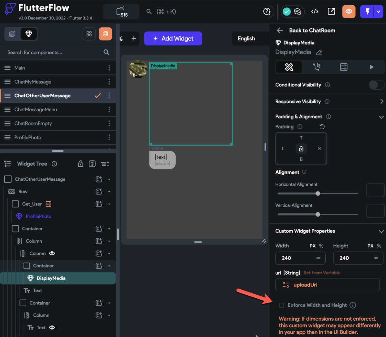
And wrap it with a container, put border property, and enable Clip Content.
The DisplayMedia widget of FlutterFlow_Widget displays files like below.
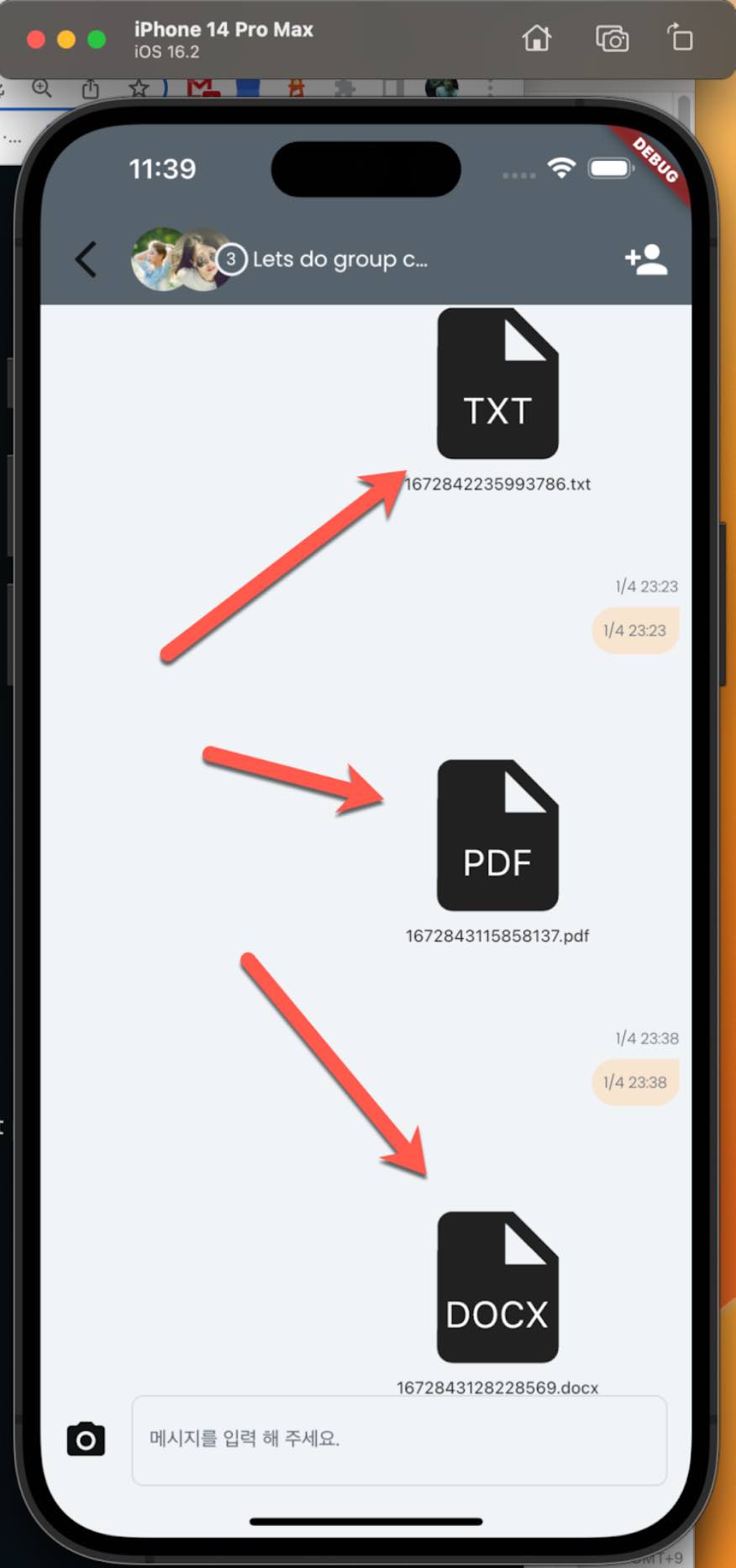
It displays the file of the given url but does not react on tap. So, it is up to you how you want to design your app.
SafeArea widget #
You can Enable/Disable the SafeArea in FF. But you cannot give SafeArea on top only or bottom only. And you cannot optionally add a space to make the contents(widgets) appear safely from the notches.
For instance, you want to design your app with an image that displays as a background of the full screen. In this case you have to disable the SafeArea. But you need it enabled for some devices that have notches.
In the example below;
Some devices like the one on the left side have no notches. That’s fine without SafeArea. But some devices like the one on the right have notches at the top and at the bottom.
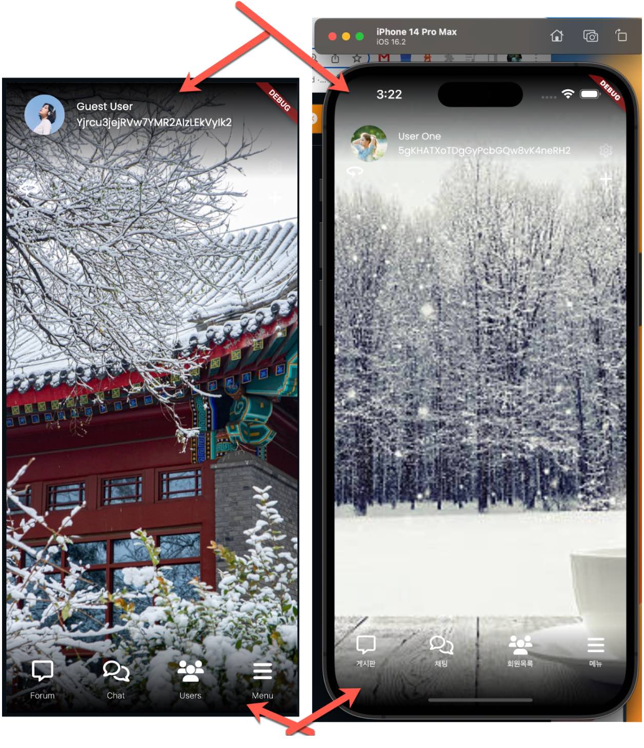
Yes, of course, you may twist the widgets to make the full screen with a background image like below. But that has limitations and the widget tree goes crazy.
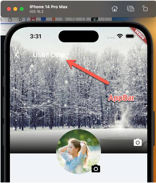
So?
Here comes with the two widgets. SafeAreaTop and SafeAreaBottom.
Here is how to create SafeAreaTop and SafeAreaBottom widgets using Fireflow.
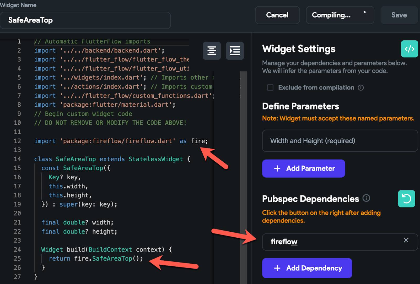
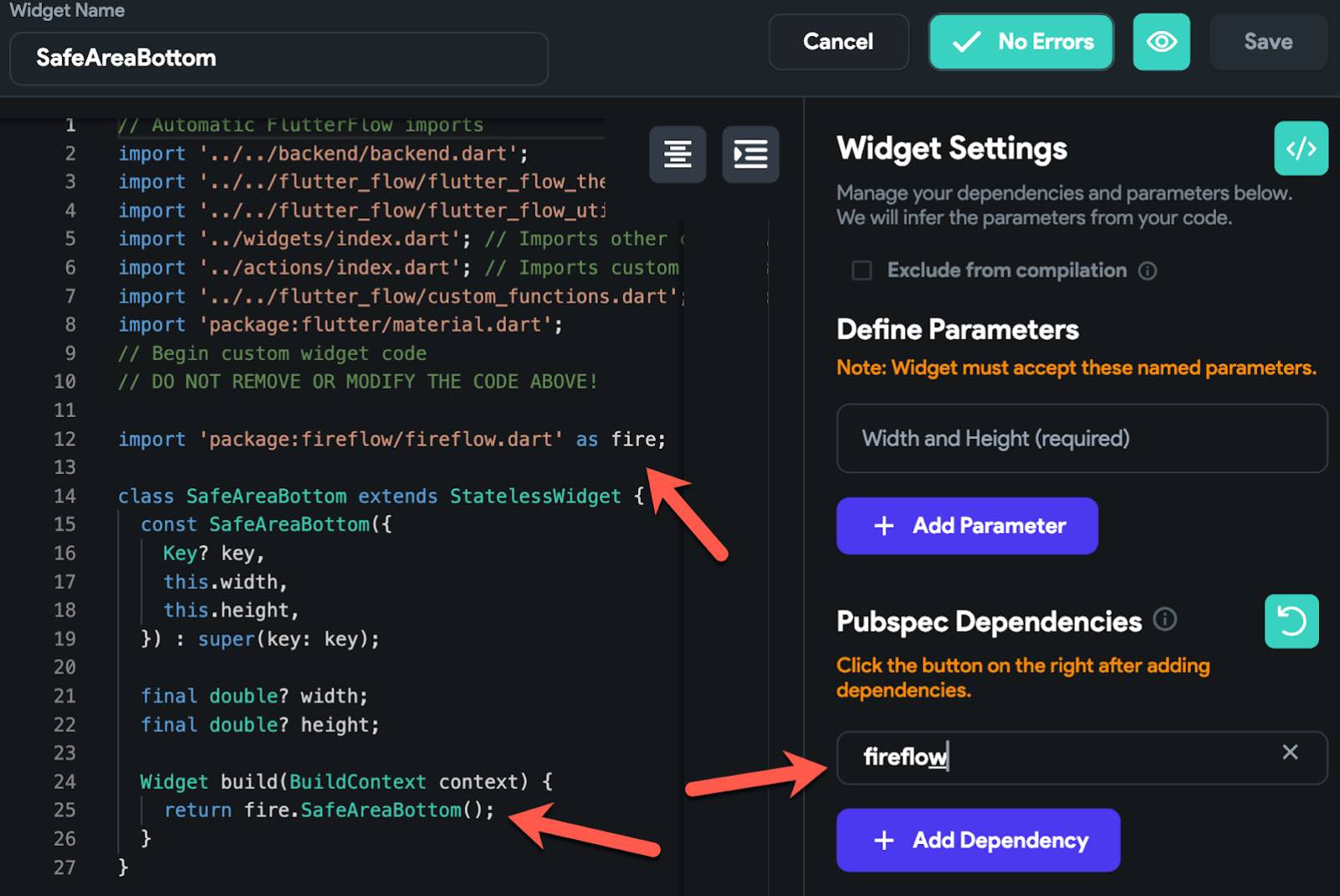
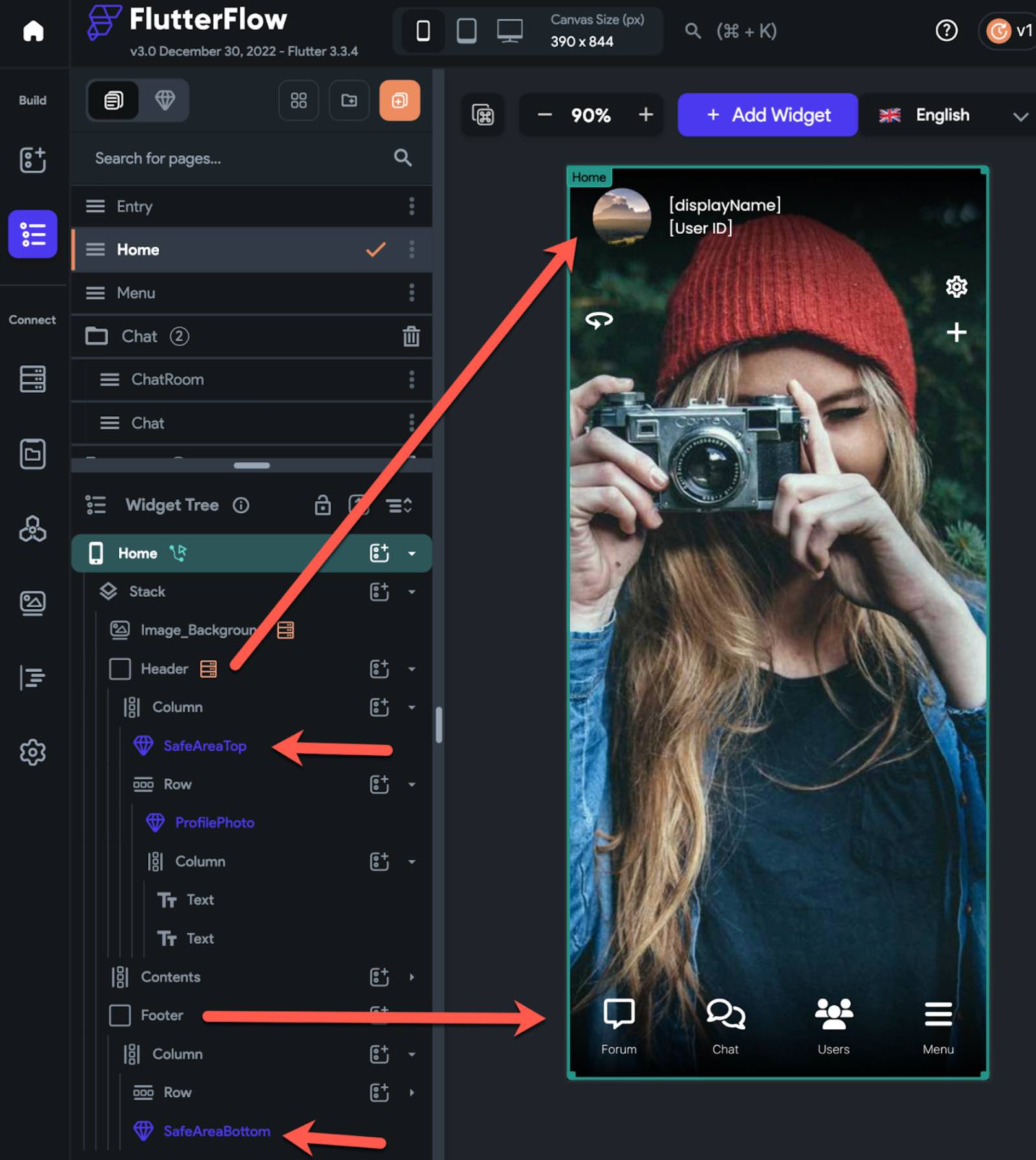
How to layout the SafeAreaTop and SafeAreaBottom widgets.
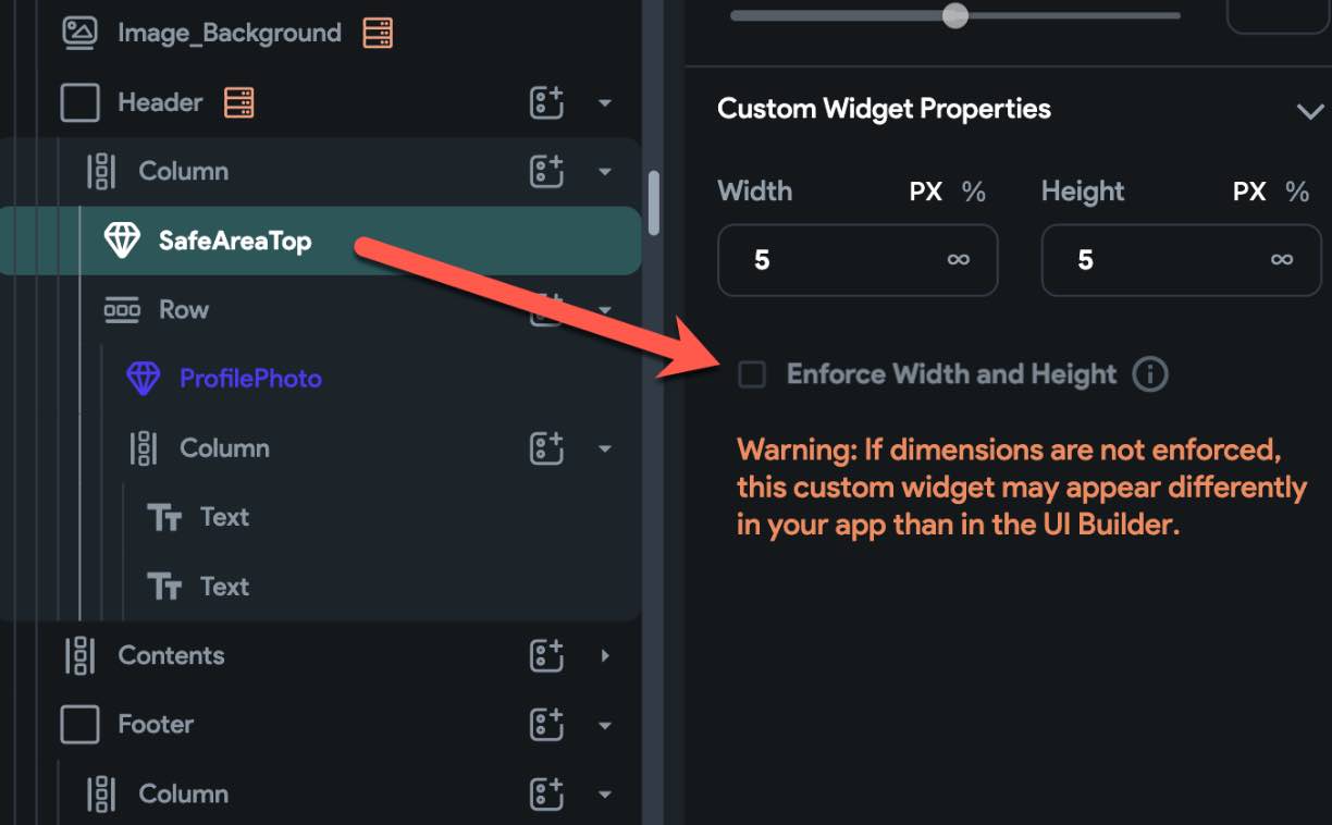
Be sure that you disable the Enforce Width and Height option.
Snackbar #
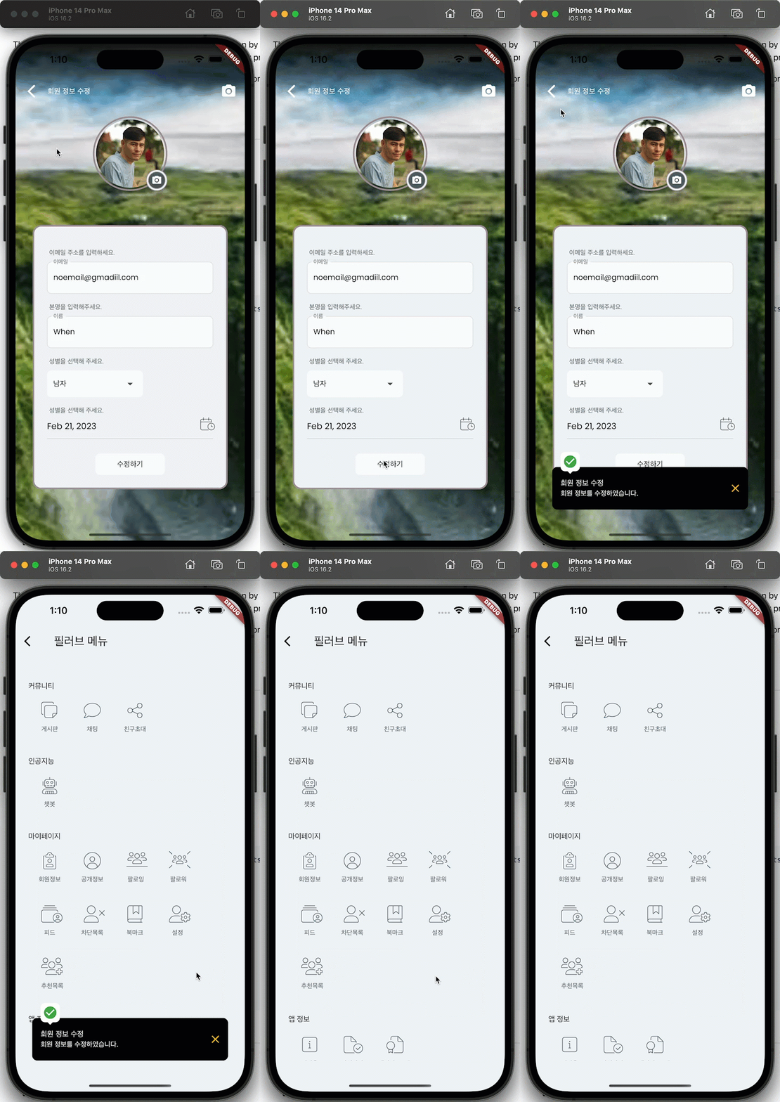
The snackbar is an action that it does appear on the screen by an action. You can show a snackbar on On Page Load event, or when a user presses a button.
You need to create a custom action like below and call the action.
You can name the action by yourself.
success snackbar #
Action Settings
- Include BuildContext
- No return value
Define Arguments
| Parameter Name | Type | List | Nullable |
|---|---|---|---|
| title | String | No | No |
| message | String | No | No |
import 'package:flutterflow_widgets/flutterflow_widgets.dart';

Future successSnackbar(
  BuildContext context,
  String title,
  String message,
) async {
  // Add your function code here!
  snackBarSuccess(
    context: context,
    title: title,
    message: message,
  );
}
error snackbar #
Action Settings
- Include BuildContext
- No return value
Define Arguments
| Parameter Name | Type | List | Nullable |
|---|---|---|---|
| title | String | No | No |
| message | String | No | No |
import 'package:flutterflow_widgets/flutterflow_widgets.dart';

Future errorSnackbar(
  BuildContext context,
  String title,
  String message,
) async {
  // Add your function code here!
  snackBarWarning(
    context: context,
    title: title,
    message: message,
  );
}
Using go_router context to let the snackbar work after page change #
When a snackbar is open and the user moves to antoher page, then the context of the snackbar would be invalid. And when user press the close icon, the snackbar will not be closed immediately.
You can give the context of go_router in this case if you are using the Routing in FF app details settings.
import 'package:flutterflow_widgets/flutterflow_widgets.dart';
import 'package:go_router/go_router.dart';

Future successSnackbar(
  BuildContext context,
  String title,
  String message,
) async {
  // Add your function code here!
  snackBarSuccess(
    context: GoRouter.of(context).routerDelegate.navigatorKey.currentContext!,
    title: title,
    message: message,
  );
}
Customizing the snackbar #
You can use showSnackbar method. The snackBarSuccess and snackBarWarning are merely a wrapper of showSnackbar with different properties.
showSnackBar(
  GoRouter.of(context).routerDelegate.navigatorKey.currentContext!,
  snackBarContent(
    context: GoRouter.of(context).routerDelegate.navigatorKey.currentContext!,
    title: title,
    message: message,
    backgroundColor: Colors.black.withAlpha(190),
    closeButtonColor: Colors.white,
    icon: const Icon(Icons.check_circle, color: Colors.green, size: 28),
    arrowBackgroundColor: Colors.white,
    seconds: 20,
  ),
);
CustomCalendar #
You can display the number of events on the dates of the calendar. See the Example FlutterFlow Project.
-
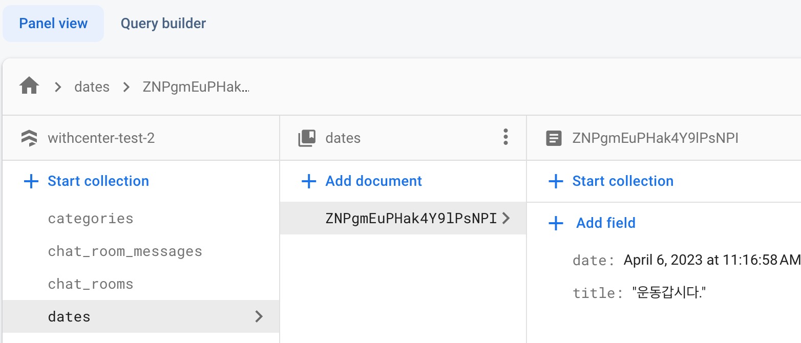
The documet must have
datefield.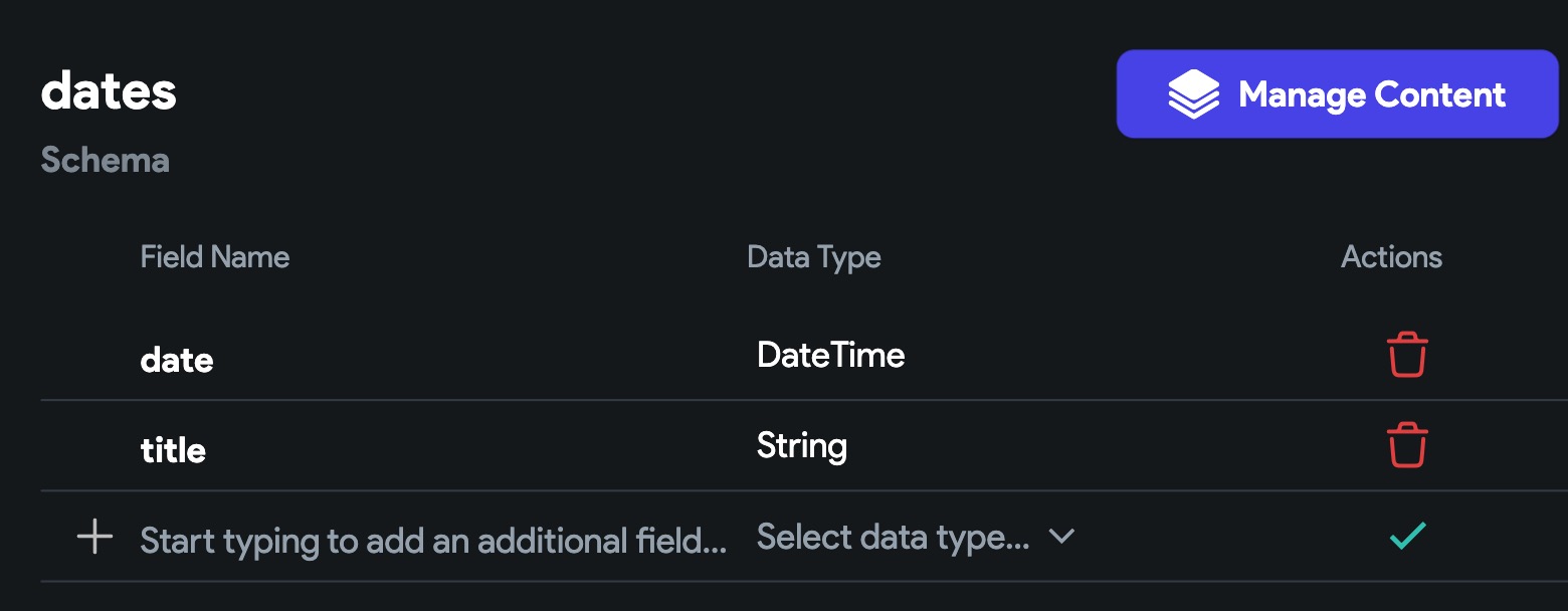
-
Set a variable named
eventswith the type ofList < JSON >on AppState.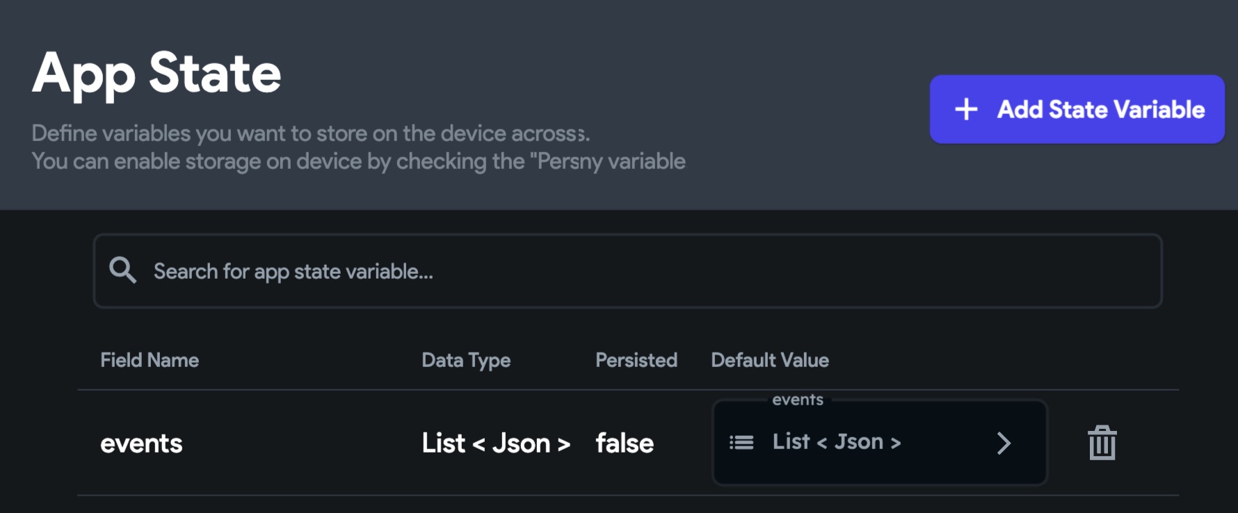
-
Create a custom widget. Let's name it
MyCalendar. See the images below. -
Add a
onTapaction parameter to theMyCalendar.- When the user taps on a day, the
MyCalendarwill save the event information on theeventsApp State and will call theonTapaction. So you need to add your own action and pass it over theMyCalendar.
- When the user taps on a day, the
-
When the user taps on a day, your action will run. You can get the events from
eventsApp State and display in on screen.
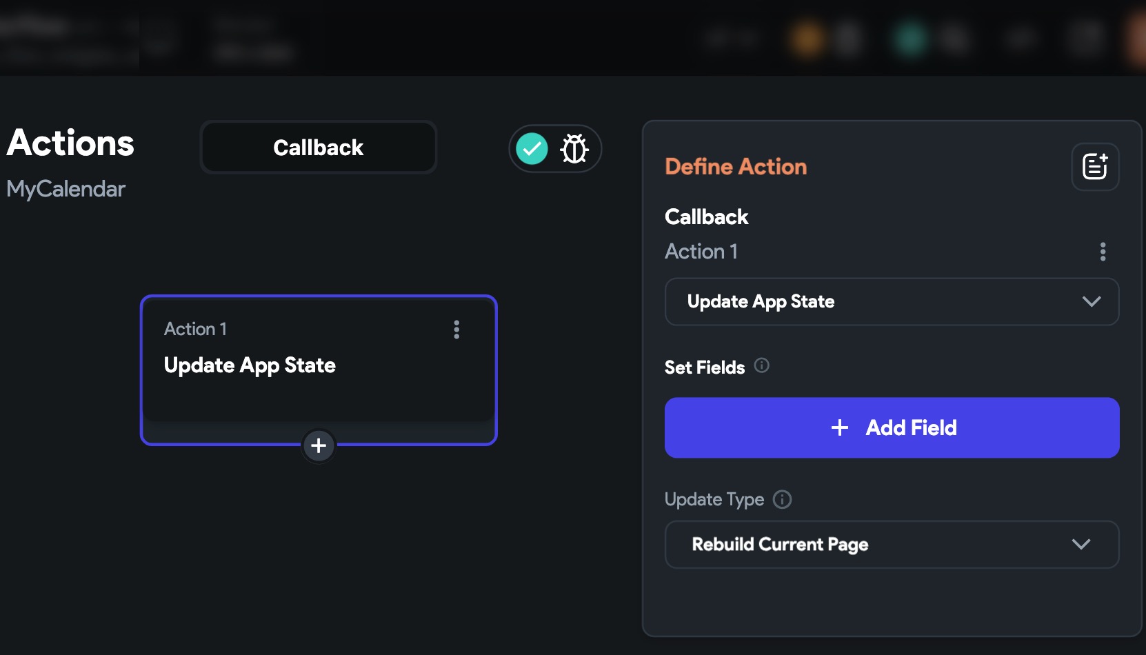
-
Display the
eventsfrom AppState into a ListView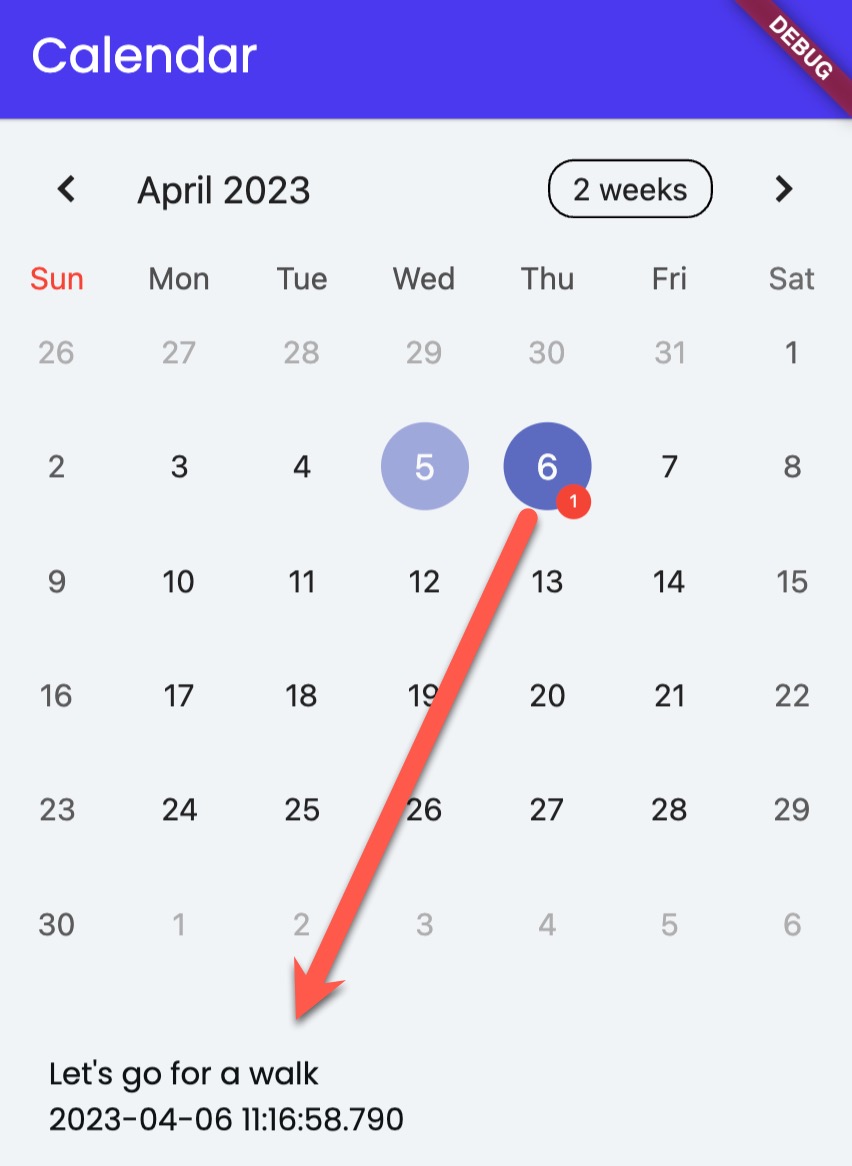
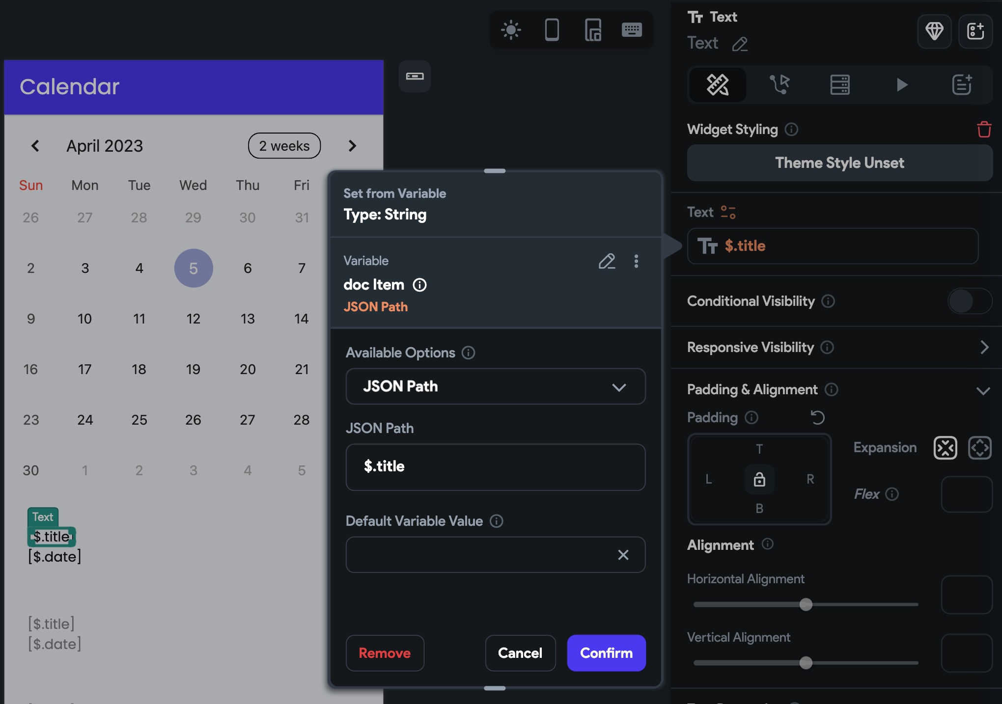
-
There are two examples below.
- The first one does Firestore backend query with custom code. You can copy and use it without modification. Well of course, you can modify if you want.
- The second one does Firebase backend query with the native FF Firestore backend query. But you have to modify the custom code especially for the event data converting.
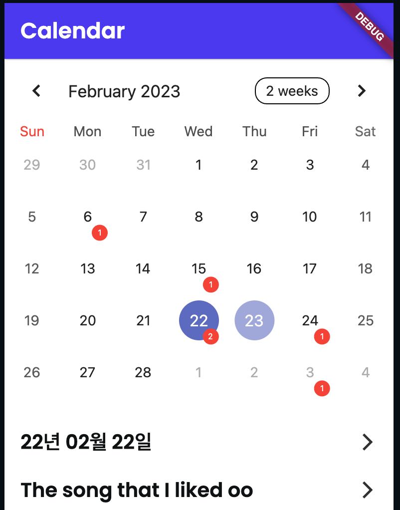
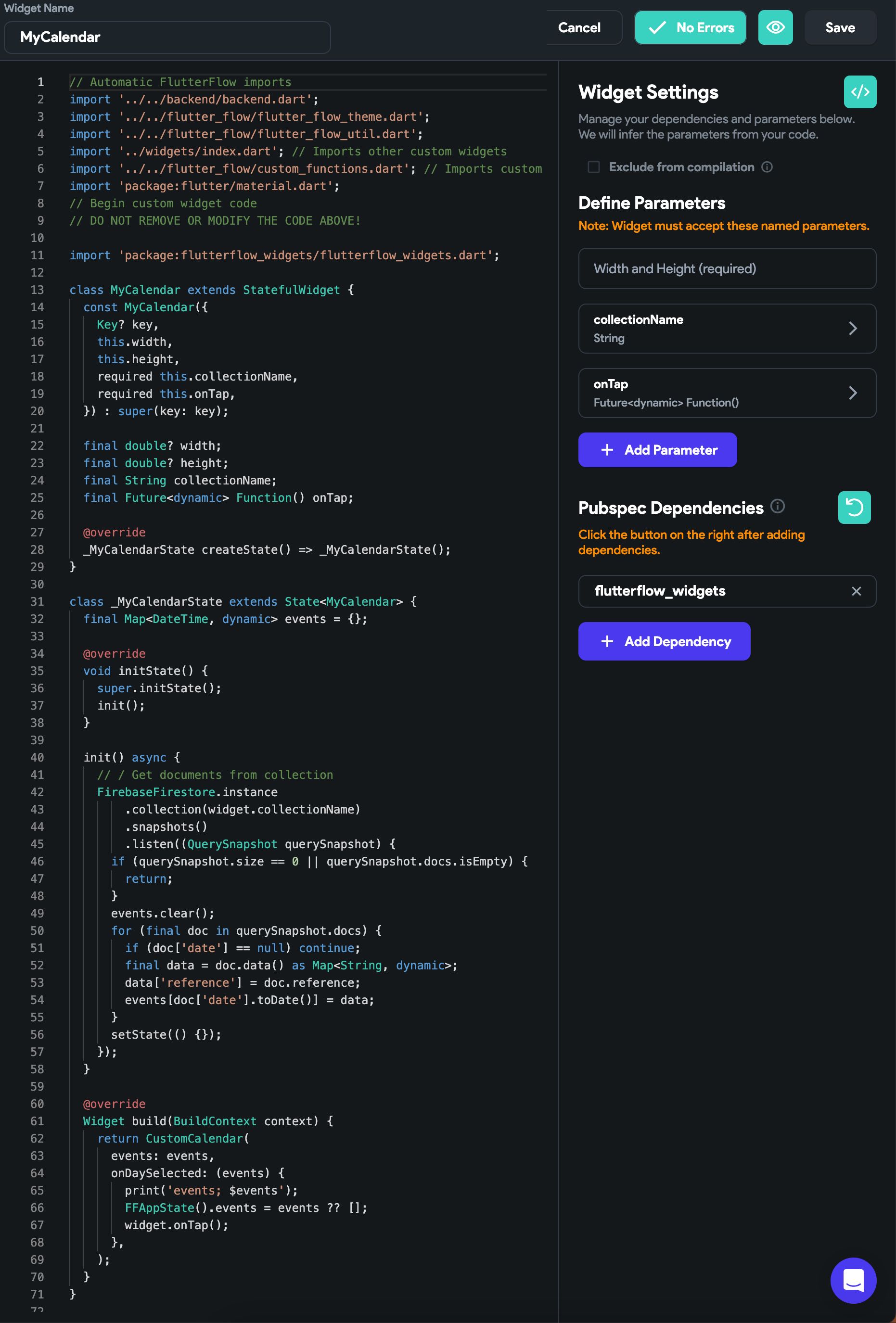
- Example of custom widget to display the number of events from firestore in realtime.
import 'package:flutterflow_widgets/flutterflow_widgets.dart';

class MyCalendar extends StatefulWidget {
  const MyCalendar({
    Key? key,
    this.width,
    this.height,
    required this.collectionName,
    required this.onTap,
  }) : super(key: key);

  final double? width;
  final double? height;
  final String collectionName;
  final Future<dynamic> Function() onTap;

  @override
  _MyCalendarState createState() => _MyCalendarState();
}

class _MyCalendarState extends State<MyCalendar> {
  final Map<DateTime, dynamic> events = {};

  @override
  void initState() {
    super.initState();
    init();
  }

  init() async {
    // / Get documents from collection
    FirebaseFirestore.instance.collection(widget.collectionName).snapshots().listen((QuerySnapshot querySnapshot) {
      if (querySnapshot.size == 0 || querySnapshot.docs.isEmpty) {
        return;
      }
      events.clear();
      for (final doc in querySnapshot.docs) {
        if (doc['date'] == null) continue;
        final data = doc.data() as Map<String, dynamic>;
        data['reference'] = doc.reference;
        events[doc['date'].toDate()] = data;
      }
      setState(() {});
    });
  }

  @override
  Widget build(BuildContext context) {
    return CustomCalendar(
      events: events,
      onDaySelected: (events) {
        print('events; $events');
        FFAppState().events = events ?? [];
        widget.onTap();
      },
    );
  }
}
Instead of passing the collection name into the method and do the firebase things inside, you can do the Firestore backend query and pass the list of the document you have.
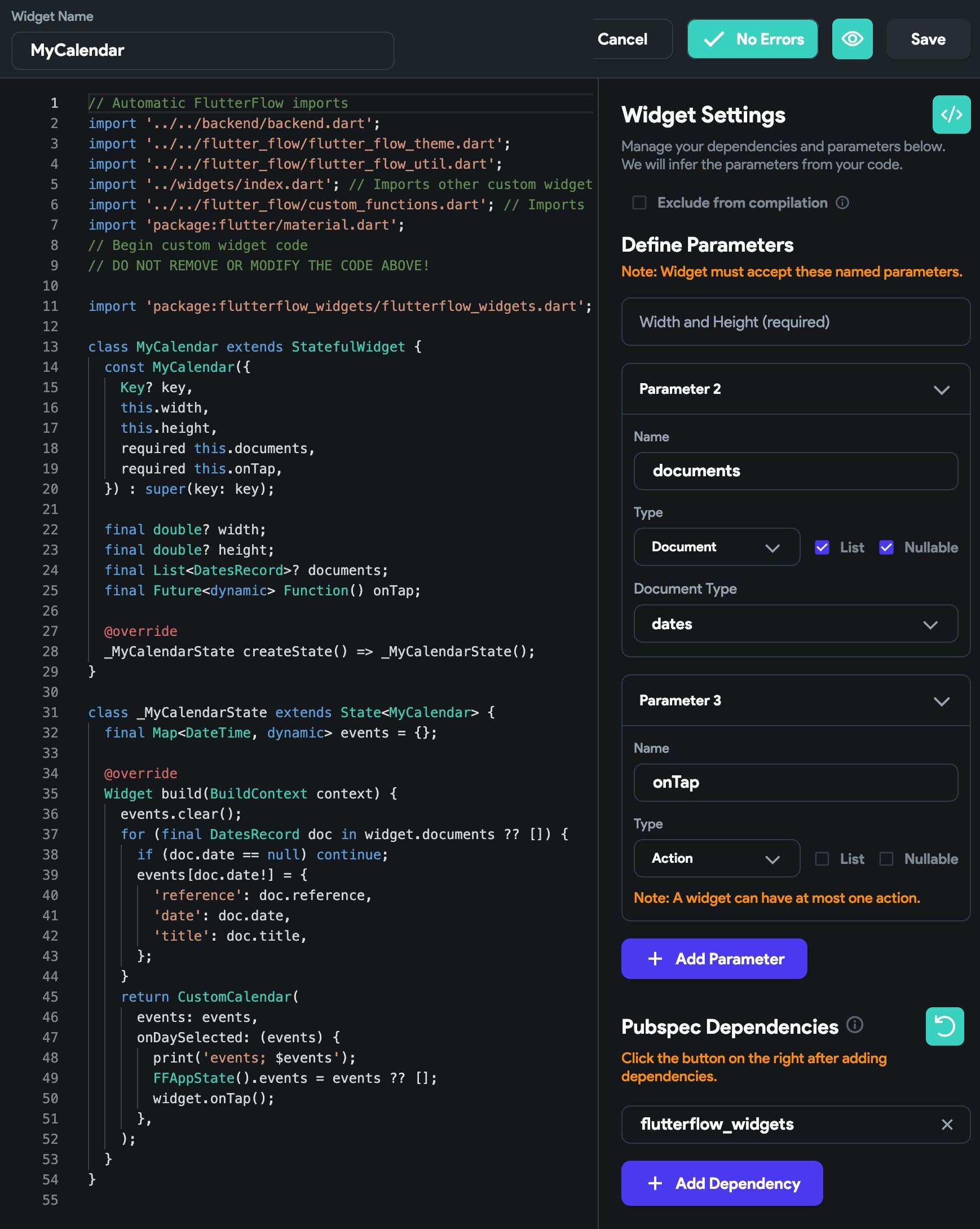
import 'package:flutterflow_widgets/flutterflow_widgets.dart';

class MyCalendar extends StatefulWidget {
  const MyCalendar({
    Key? key,
    this.width,
    this.height,
    required this.documents,
    required this.onTap,
  }) : super(key: key);

  final double? width;
  final double? height;
  final List<DatesRecord>? documents;
  final Future<dynamic> Function() onTap;

  @override
  _MyCalendarState createState() => _MyCalendarState();
}

class _MyCalendarState extends State<MyCalendar> {
  final Map<DateTime, dynamic> events = {};

  @override
  Widget build(BuildContext context) {
    events.clear();
    for (final DatesRecord doc in widget.documents ?? []) {
      if (doc.date == null) continue;
      events[doc.date!] = {
        'reference': doc.reference,
        'date': doc.date,
        'title': doc.title,
      };
    }
    return CustomCalendar(
      events: events,
      onDaySelected: (events) {
        print('events; $events');
        FFAppState().events = events ?? [];
        widget.onTap();
      },
    );
  }
}
The code below is even more short.
import 'package:flutterflow_widgets/flutterflow_widgets.dart';

class MyCalendar extends StatefulWidget {
  const MyCalendar({
    Key? key,
    this.width,
    this.height,
    required this.documents,
    required this.onTap,
  }) : super(key: key);

  final double? width;
  final double? height;
  final List<DatesRecord>? documents;
  final Future<dynamic> Function() onTap;

  @override
  _MyCalendarState createState() => _MyCalendarState();
}

class _MyCalendarState extends State<MyCalendar> {
  @override
  Widget build(BuildContext context) {
    return CustomCalendar(
      events: Map.fromEntries(widget.documents!.map((e) => MapEntry(e.date!, {
            'reference': e.reference,
            'date': e.date,
            'title': e.title,
          }))),
      onDaySelected: (events) {
        FFAppState().events = events ?? [];
        widget.onTap();
      },
    );
  }
}
IconLabelColumn #
- It's a simple widget of a combination of icon and label in column. It shows icon on top and label at bottom. That's it.
Example of UI
![]()
IconLabelColumn(
  icon: Icons.favorite,
  label: 'Favorite',
)