

flex_color_scheme 6.0.1  flex_color_scheme: ^6.0.1 copied to clipboard
 rydmike.com
A Flutter package to use and make beautiful Material design based themes.

FlexColorScheme #
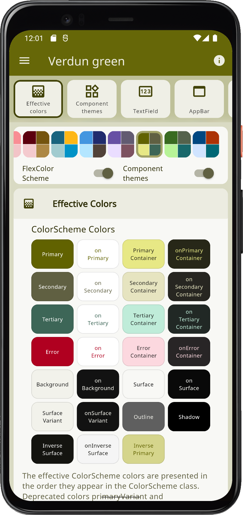
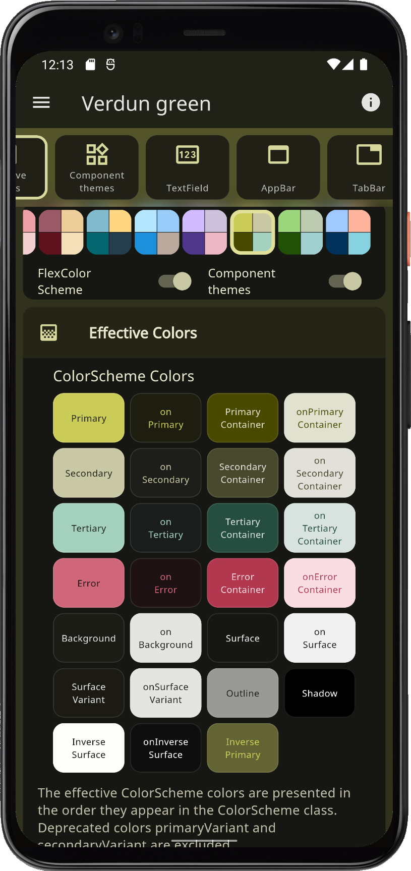
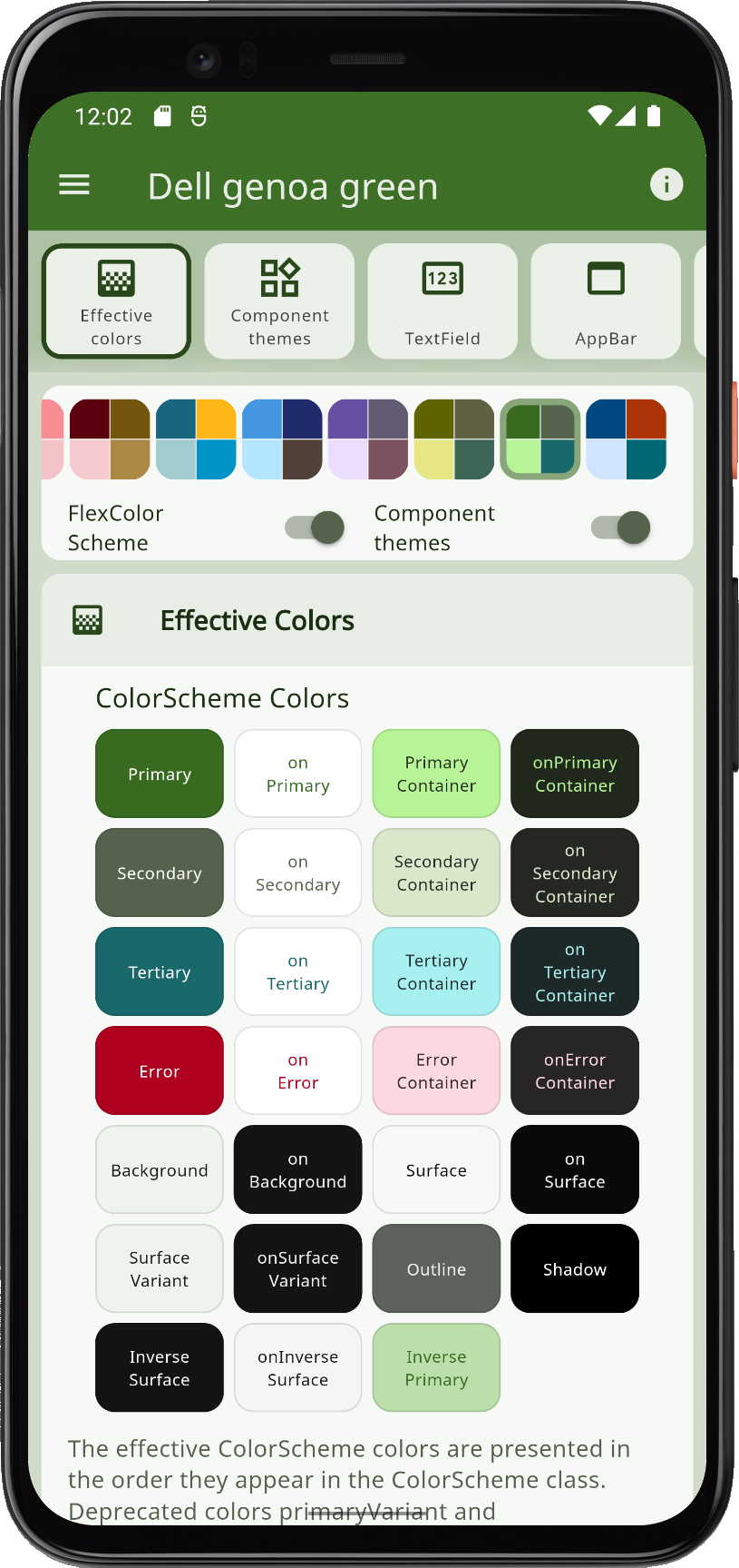
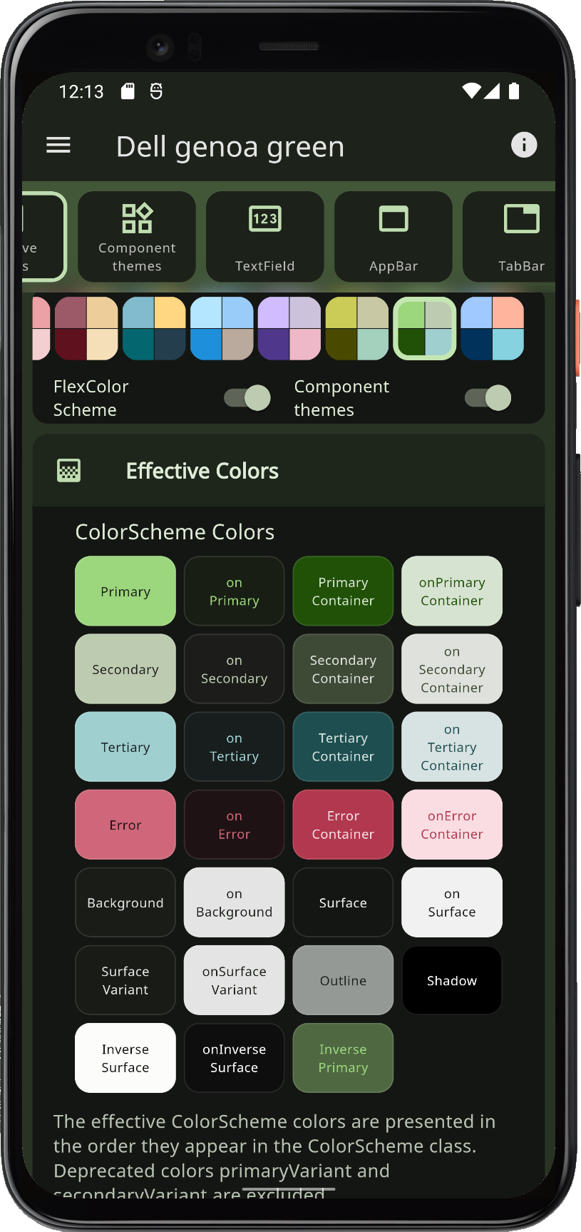
Use FlexColorScheme to make beautiful color scheme based Flutter Material design themes, with optional primary color surface blends, or key color seeded color schemes. The themes are based on the same concept as Flutter's ColorScheme based themes, but offers many additional features, and numerous pre-made themes.
 |
 |
 |
 |
When you theme a Flutter application correctly, all built-in widgets use the colors of the ColorScheme in your theme. At least in theory, and it is almost so if you defined your ThemeData by using the ThemeData.from factory, but it misses a few details.
FlexColorScheme ensures that all Flutter SDK UI components gets themed completely by its color schemes and custom colors you provide. It applies effective ColorScheme colors to all color properties in ThemeData, as long as they still exist. This ensures that all the direct colors properties in ThemeData match your ColorScheme. There are no surprises in ThemeData that do not match your ColorScheme.
You can opt in on using opinionated component sub-themes. By doing so you can for example adjust the border radius on all UI widgets with a single property value. Flutter's Material UI widgets still default to being based on the Material 2 design, and thus use 4 dp corner radius on most widgets.
When you opt in on using the component sub-themes, the border radius on widgets default to the new rounded corners as specified by the Material 3 guide, where the radius varies by widget type. You can keep this, or set the global widget radius to a value you prefer. You can also easily set the themed border radius per widget, and override the Material 3 default, or the global radius value you defined.
 |
 |
 |
 |
With FlexColorScheme component themes you use simple flat property values. No need for verbose Flutter SDK component sub-themes, with ShapeBorder definitions on multiple widget themes to change their border radius. The component theming provides a large amount of easy to configure options via simple flat properties, instead of complicated nested ones. In many cases you can also avoid the both complicated and confusing MaterialState theming properties.
FlexColorScheme has many advanced coloring features, like using surface alpha blends. It also fully supports Material 3 based color schemes, including seed generated ColorSchemes. It offers different configuration options that you can use when you generate your ColorScheme from
key colors, customization features that are currently not available in Flutter. This includes using multiple key colors as seed, custom minimum chroma levels and customized tone mapping to ColorScheme colors.
Getting Started #
To use FlexColorScheme in your project, add the flex_color_scheme package to pubspec.yaml:
dart pub add flex_color_scheme or flutter pub add flex_color_scheme
Import the package to use it:
import 'package:flex_color_scheme/flex_color_scheme.dart';
You can now start using FlexColorScheme based color schemes and theming in your application. A quick way to do so, is to try one of the 40 built-in color schemes. They have enum values that you can use to select which one to use as the theme of your application.
The package default example offers a heavily commented code guide on how to use almost every property in FlexColorScheme. The examples chapter shows you how to try it, as well as the five tutorial examples.
FlexColorScheme Counter App #
Let's first setup FlexColorScheme in the default Flutter counter app. Create a new Flutter project, giving you the default counter app. Add the FlexColorScheme import, after that we change one line of code, and add two lines to enable it in the default counter app.
Here we use the Oh Mandy red color scheme, it is represented by enum value FlexScheme.mandyRed. Set the MaterialApp.themeMode to ThemeMode.system so that the device can control if the app uses its light or dark theme mode. You can then toggle theme mode by changing theme mode on the used device.
Assign FlexThemeData.light to the app's theme property, which is the application's light theme definition property, and FlexThemeData.dark to darkTheme.
For both FlexThemeData dark and light we set the scheme property to FlexScheme.mandyRed to use the same Oh Mandy red predefined scheme colors in both theme modes. We then get matching light and dark themes based on the built-in scheme's color definitions.
The three line modified MaterialApp, of the Flutter default counter app becomes:
class MyApp extends StatelessWidget {
  const MyApp({Key? key}) : super(key: key);
  @override
  Widget build(BuildContext context) {
    return MaterialApp(
      title: 'Flutter Demo',
      // The Mandy red, light theme.
      theme: FlexThemeData.light(scheme: FlexScheme.mandyRed),
      // The Mandy red, dark theme.
      darkTheme: FlexThemeData.dark(scheme: FlexScheme.mandyRed),
      // Use dark or light theme based on system setting.
      themeMode: ThemeMode.system,
      home: const MyHomePage(title: 'Flutter Demo Home Page'),
    );
  }
}
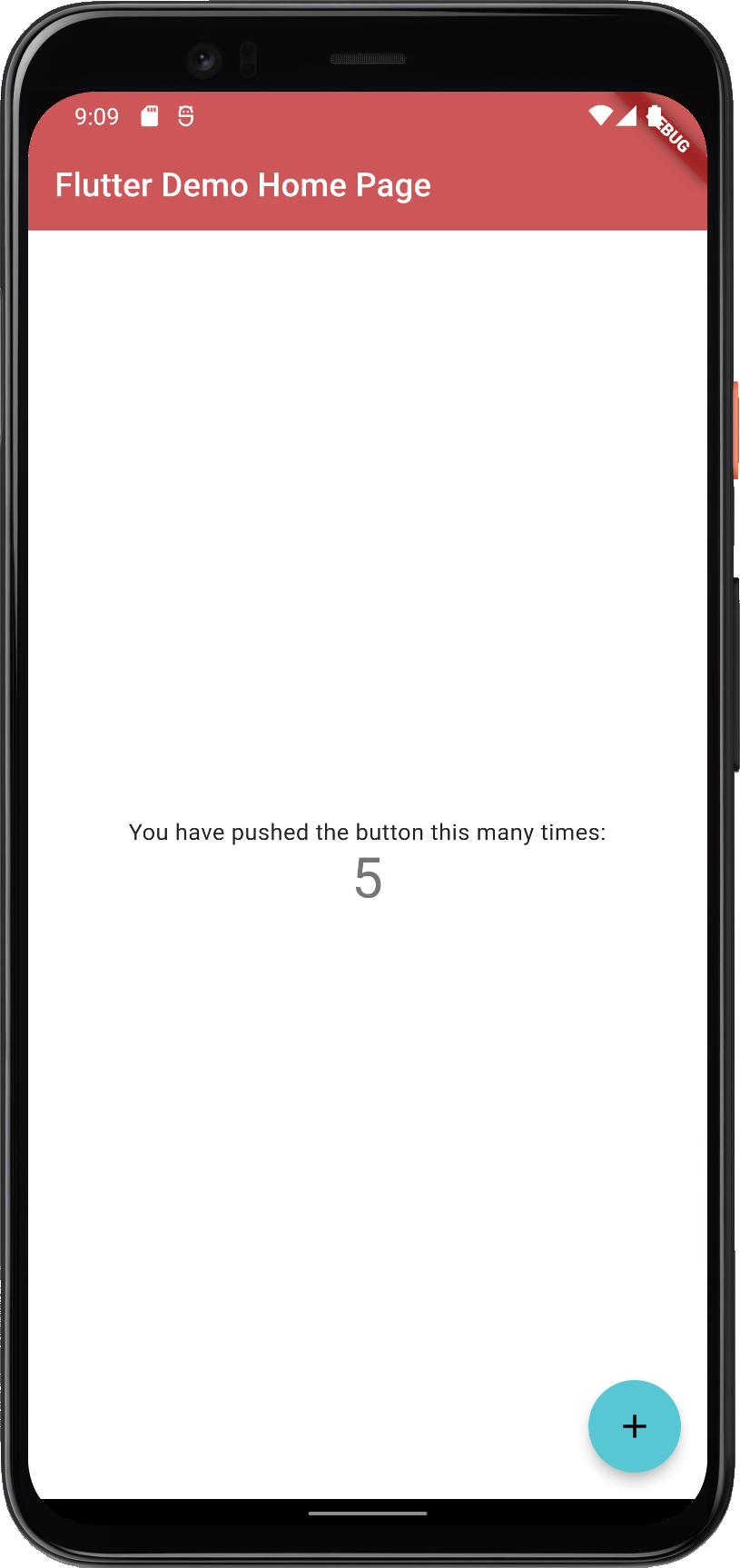
This gives us a counter application that looks like this:
 |
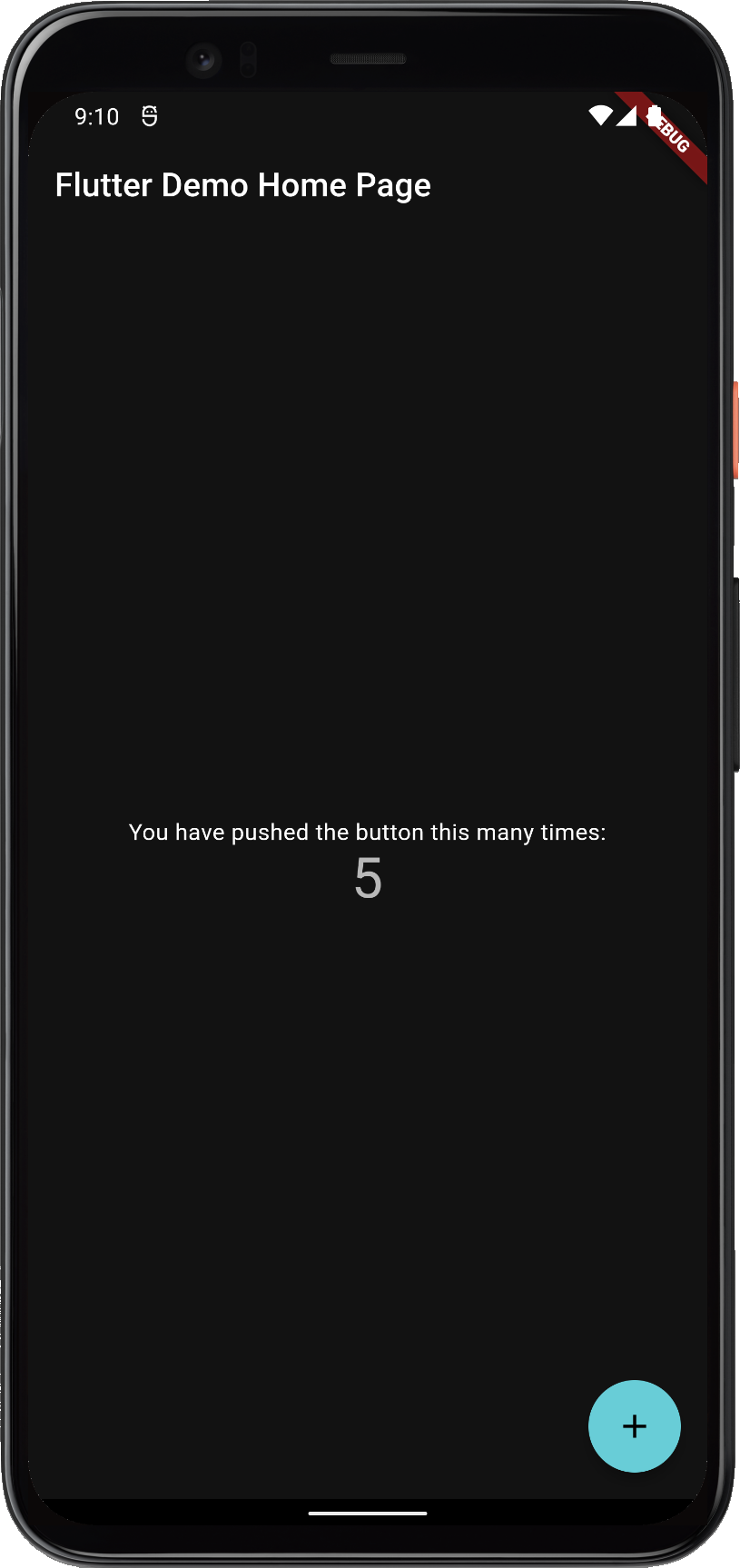 |
FlexColorScheme applied on the standard Flutter counter template
Not as exciting as the images shown above. That is because the basic counter app uses very few features and widgets, so it does not present the results very well.
The included examples contain dummy user interface to better demonstrate the results. The used UI demonstration code in the examples, is not relevant to using FlexColorScheme, it is only there to present the results.
Documentation #
For more information and tutorials on how to use FlexColorScheme, please see its documentation site at docs.flexcolorscheme.com. It contains additional getting started info, extensive tutorials, key API walkthrough and even general Flutter theming advice and guidance.
Please refer to it for more information and guidance on its usage and features. The documentation site is powered by docs.page from Invertase.
Complete generated package API documentation is also available. The API docs are very thorough.
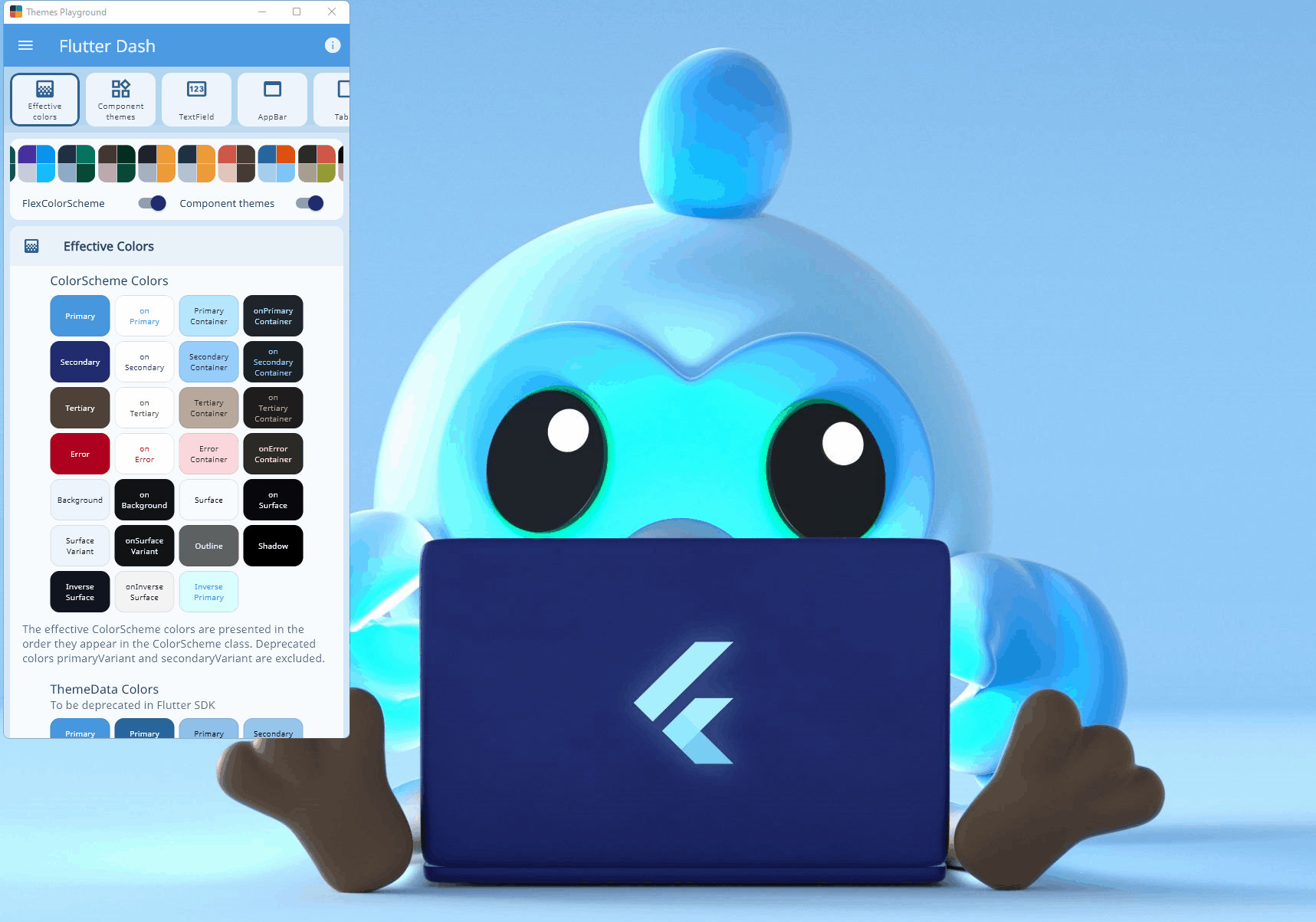
Themes Playground #
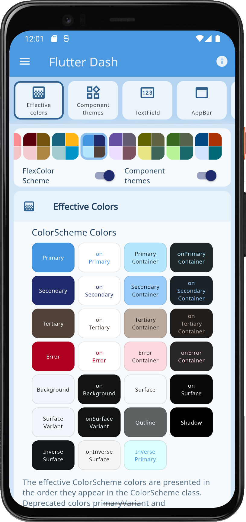
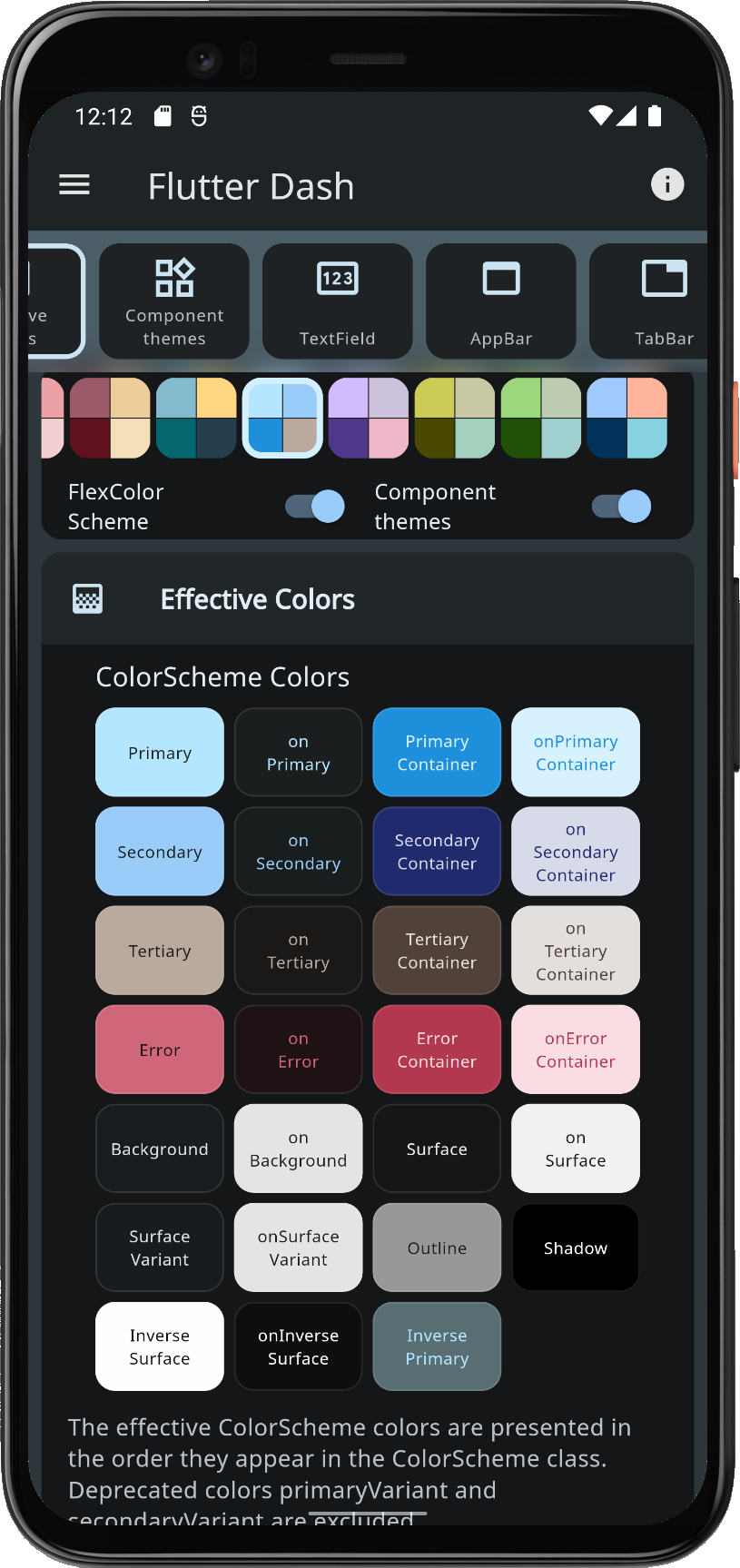
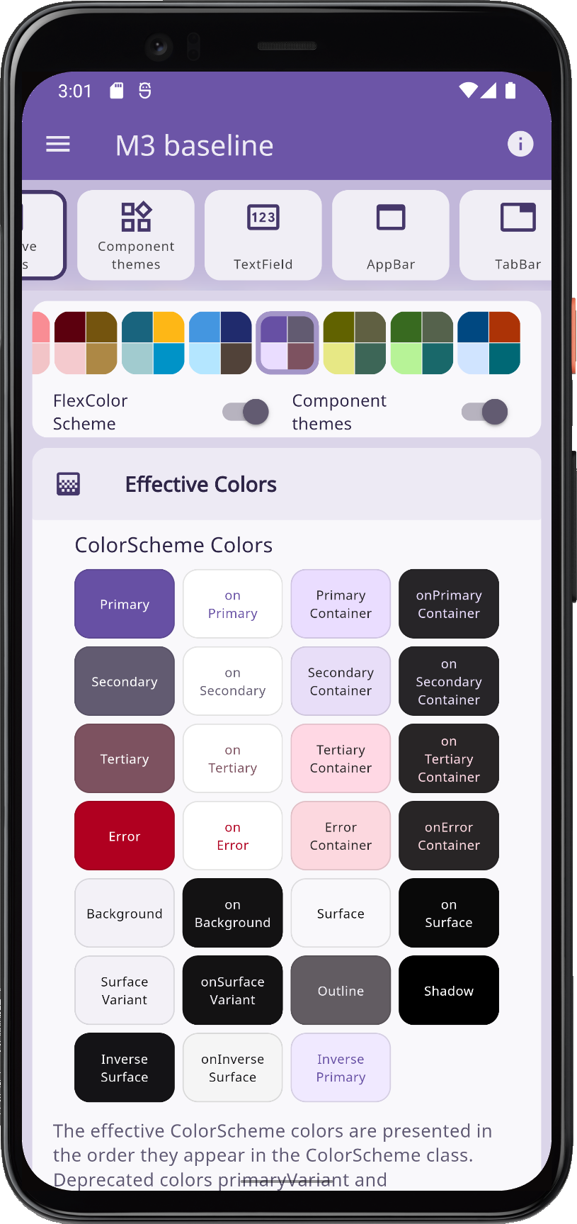
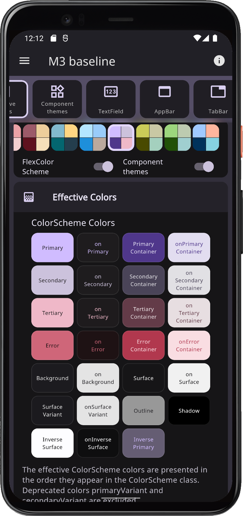
To make it even easier to configure and setup FlexColorScheme, it comes with a WEB app called the Themes Playground.
The Themes Playground is a useful tool to find FlexColorScheme themes and settings you like. You can use it to discover what you can do with FlexColorScheme. The playground persists all its settings, and you can reset them back to their default values, so don't be afraid to experiment.
The most useful and popular feature of the Themes Playground is that it can generate FlexColorScheme API setup code needed to produce the shown active theme configuration. It even shows and modifies the code as you change settings. You can see the code side-by-side as you change settings. This is a fun way to get familiar with the API. Beware, fiddling with all the different themes and settings can be quite addictive, happy theming! 💙
The Themes Playground can be used as a web app here.
For guidance on how to use the Themes Playground, please read the Themes Playground chapter in the docs.
Open Source #
The Themes Playground application is open source and bundled with the FlexColorScheme package in the example sub-folder. In its GitHub repository you can find it here.
The Playground app is also the last step in the package tutorial series. The tutorial goes through its main used features that are relevant to using FlexColorScheme, and features that differ from the previous examples. It does not go through all the details of the application. You are welcome to study its source code for more insights. It is on purposes a bit excessively commented. The tutorial also briefly talks about it's background, design choices and limitations.
Older versions of Themes Playground #
If you are using FlexColorScheme version 5, you can go here to use Themes Playground V5, to generate API setup code for it.
If you are using FlexColorScheme version 4, you should really upgrade, but you can still try Themes Playground V4 here, but it does not offer any API code generation, since version 4 did not have that feature.
Metadata
Publisher
Metadata
A Flutter package to use and make beautiful Material design based themes.
Homepage
Repository (GitHub)
View/report issues
Documentation
License
 unknown (LICENSE)
Dependencies
flex_seed_scheme, flutter, meta