expandable 3.0.1  expandable: ^3.0.1 copied to clipboard
A Flutter widget that can be expanded or collapsed by clicking on a header or an icon.
Expandable #
A Flutter widget that can be expanded or collapsed by the user.
Introduction #
This library helps implement expandable behavior as prescribed by Material Design:
Expandable should not be confused with
ExpansionPanel.
ExpansionPanel, which is a part of
Flutter material library, is designed to work only within ExpansionPanelList and cannot be used
for making other widgets, for example, expandable Card widgets.
Usage #
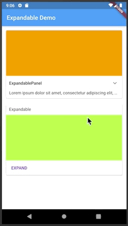
The easiest way to make an expandable widget is to use ExpandablePanel:
class ArticleWidget extends StatelessWidget {

  final Article article;

  ArticleWidget(this.article);

  @override
  Widget build(BuildContext context) {
    return ExpandablePanel(
      header: Text(article.title),
      collapsed: Text(article.body, softWrap: true, maxLines: 2, overflow: TextOverflow.ellipsis,),
      expanded: Text(article.body, softWrap: true, ),
      tapHeaderToExpand: true,
      hasIcon: true,
    );
  }
}
ExpandablePanel has a number of properties to customize its behavior, but it's restricted by
having a title at the top and an expand icon shown as a down arrow (on the right or on the left).
If that's not enough, you can implement custom expandable widgets by using a combination of Expandable,
ExpandableNotifier, and ExpandableButton:
class EventPhotos extends StatelessWidget {

  @override
  Widget build(BuildContext context) {
    return ExpandableNotifier(  // <-- Provides ExpandableController to its children
      child: Column(
        children: [
          Expandable(           // <-- Driven by ExpandableController from ExpandableNotifier
            collapsed: ExpandableButton(  // <-- Expands when tapped on the cover photo
              child: buildCoverPhoto(),
            ),
            expanded: Column(
              children: [
                buildAllPhotos(),
                ExpandableButton(       // <-- Collapses when tapped on
                  child: Text("Back"),
                ),
              ]
            ),
          ),
        ],
      ),
    );
  }
}
Automatic Scrolling #
Expandable widgets are often used within a scroll view. When the user expands a widget, be it
an ExpandablePanel or an Expandable with a custom control, they expect the expanded
widget to fit within the viewable area (if possible). For example, if you show a list of
articles with a summary of each article, and the user expands an article to read it, they
expect the expanded article to occupy as much screen space as possible. The Expandable
package contains a widget to help implement this behavior, ScrollOnExpand.
Here's how to use it:
   ExpandableNotifier(      // <-- This is where your controller lives
     //...
     ScrollOnExpand(        // <-- Wraps the widget to scroll
      //...
        ExpandablePanel(    // <-- Your Expandable or ExpandablePanel
          //...
        )
     )
  )
Why a separate widget, you might ask? Because generally you might want to to show not just
the expanded widget but its container, for example a Card that contains it.
See the example app for more details on the usage of ScrollOnExpand.
Migration #
If you have migration issues from a previous version, read the Migration Guide.
Metadata
Publisher
unverified uploader
Metadata
A Flutter widget that can be expanded or collapsed by clicking on a header or an icon.
Repository (GitHub)
View/report issues
License
 MIT (LICENSE)