drop_down_search_field 1.0.4  drop_down_search_field: ^1.0.4 copied to clipboard
Customizable DropdownSearchField extending features DropdownButton, TextFormField and Autocomplete.

Flutter DropDownSearchField #
A DropDownSearchField (autocomplete) widget for Flutter, where you can show suggestions to users as they type
Features #
- Displays suggestions in a floating overlay above other widgets.
- Allows customization of the suggestion appearance using a builder function.
- Enables specification of the action when a user taps on a suggestion.
- Supports all parameters typically used with TextFields, including decoration, custom TextEditingController, and text styling.
- Offers two versions: a standard version and a FormField version that includes validation and submission features.
- Highly customizable with options to modify the suggestion box decoration, loading bar, animation, debounce duration, and more.
Installation #
See the installation instructions on pub.
Note: As for DropDownSearchField 1.X this package is based on Dart 3.0 (null-safety). You may also want to explore the new built in Flutter 2 widgets that have similar behavior.
Usage examples #
You can import the package with:
import 'package:drop_down_search_field/drop_down_search_field.dart';
Use it as follows:
Example 1: #
DropDownSearchField(
  textFieldConfiguration: TextFieldConfiguration(
    autofocus: true,
    style: DefaultTextStyle.of(context).style.copyWith(
      fontStyle: FontStyle.italic
    ),
    decoration: InputDecoration(
      border: OutlineInputBorder()
    )
  ),
  suggestionsCallback: (pattern) async {
    return await BackendService.getSuggestions(pattern);
  },
  itemBuilder: (context, suggestion) {
    return ListTile(
      leading: Icon(Icons.shopping_cart),
      title: Text(suggestion['name']),
      subtitle: Text('\$${suggestion['price']}'),
    );
  },
  onSuggestionSelected: (suggestion) {
    Navigator.of(context).push(MaterialPageRoute(
      builder: (context) => ProductPage(product: suggestion)
    ));
  },
)
In the code above, the textFieldConfiguration property allows us to
configure the displayed TextField as we want. In this example, we are
configuring the autofocus, style and decoration properties.
The suggestionsCallback is called with the search string that the user
types, and is expected to return a List of data either synchronously or
asynchronously. In this example, we are calling an asynchronous function
called BackendService.getSuggestions which fetches the list of
suggestions.
The itemBuilder is called to build a widget for each suggestion.
In this example, we build a simple ListTile that shows the name and the
price of the item. Please note that you shouldn't provide an onTap
callback here. The DropDownSearchField widget takes care of that.
The onSuggestionSelected is a callback called when the user taps a
suggestion. In this example, when the user taps a
suggestion, we navigate to a page that shows us the information of the
tapped product.
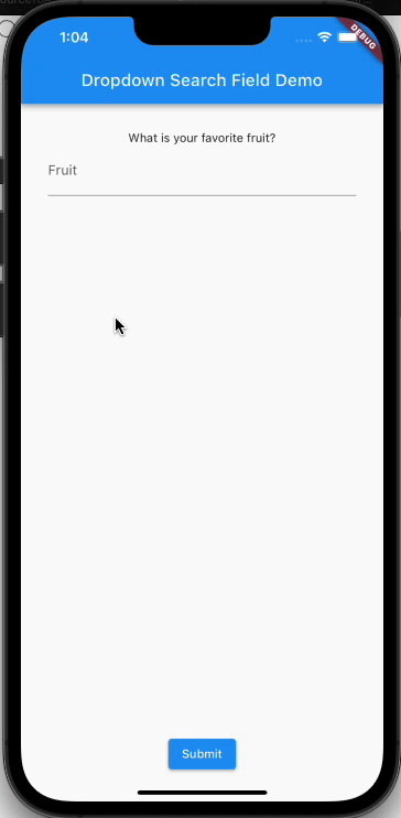
Example 2: #
Here's another example, where we use the DropDownSearchFormField inside a Form:
final GlobalKey<FormState> _formKey = GlobalKey<FormState>();
final TextEditingController _dropDownSearchController = TextEditingController();
String _selectedFruit;
...
Form(
  key: this._formKey,
  child: Padding(
    padding: EdgeInsets.all(32.0),
    child: Column(
      children: <Widget>[
        Text(
          'What is your favorite fruit?'
        ),
        DropDownSearchFormField(
          textFieldConfiguration: TextFieldConfiguration(
            controller: this._dropDownSearchController,
            decoration: InputDecoration(
              labelText: 'Fruit'
            )
          ),
          suggestionsCallback: (pattern) {
            return FruitsService.getSuggestions(pattern);
          },
          itemBuilder: (context, suggestion) {
            return ListTile(
              title: Text(suggestion),
            );
          },
          transitionBuilder: (context, suggestionsBox, controller) {
            return suggestionsBox;
          },
          onSuggestionSelected: (suggestion) {
            this._dropDownSearchController.text = suggestion;
          },
          validator: (value) {
            if (value.isEmpty) {
              return 'Please select a fruit';
            }
          },
          onSaved: (value) => this._selectedFruit = value,
        ),
        SizedBox(height: 10.0,),
        RaisedButton(
          child: Text('Submit'),
          onPressed: () {
            if (this._formKey.currentState.validate()) {
              this._formKey.currentState.save();
              Scaffold.of(context).showSnackBar(SnackBar(
                content: Text('Your Favorite Fruit is ${this._selectedFruit}')
              ));
            }
          },
        )
      ],
    ),
  ),
)
In the textFieldConfiguration, we assign the _dropDownSearchController to
the controller property. This controller is a TextEditingController.
When a suggestion is selected, we utilize the onSuggestionSelected callback
to update the value of the TextField with the selected suggestion.
The validator callback serves a similar purpose as any FormField.validator function.
In our specific example, it verifies whether a value has been entered and displays
an error message if it hasn't. The onSaved callback is employed to store the field's
value in the _selectedFruit member variable.
With the transitionBuilder, we have the flexibility to customize the animation
of the suggestion box. In the given illustration, we immediately return the
suggestionsBox without any animation.
Alternative Layout Architecture: #
By default, DropDownSearchField uses a ListView to render the items created by itemBuilder.
If you specify a layoutArchitecture component, it will use this component instead. For example,
here's how we render the items in a grid using the standard GridView:
DropDownSearchField(
    ...,
  layoutArchitecture: (items, scrollContoller) {
        return ListView(
            controller: scrollContoller,
            shrinkWrap: true,
            children: [
              GridView.count(
                physics: const ScrollPhysics(),
                crossAxisCount: 3,
                crossAxisSpacing: 8,
                mainAxisSpacing: 8,
                childAspectRatio: 5 / 5,
                shrinkWrap: true,
                children: items.toList(),
              ),
            ]);
      },
);
Animations #
Placing DropDownSearchField in widgets with animations may cause the suggestions box to resize incorrectly. Since animation times are variable, this has to be corrected manually at the end of the animation. You will need to add a SuggestionsBoxController described below and the following code for the AnimationController.
void Function(AnimationStatus) _statusListener;

@override
void initState() {
  super.initState();
  _statusListener = (AnimationStatus status) {
    if (status == AnimationStatus.completed ||
        status == AnimationStatus.dismissed) {
      _suggestionsBoxController.resize();
    }
  };

  _animationController.addStatusListener(_statusListener);
}

@override
  void dispose() {
    _animationController.removeStatusListener(_statusListener);
    _animationController.dispose();
    super.dispose();
}
Dialogs
There is a known issue with opening dialogs where the suggestions box will sometimes appear too small.
This is a timing issue caused by the animations described above. Currently, showDialog has a duration
of 150 ms for the animations. DropDownSearchField has a delay of 170 ms to compensate for this. Until
the end of the animation can be properly detected and fixed using the solution above, this temporary fix
will work most of the time. If the suggestions box is too small, closing and reopening the keyboard will
usually fix the issue.
Customizations #
DropDownSearchField widgets consist of a TextField and a suggestion box that shows as the user types. Both are highly customizable
Customizing the TextField #
You can customize the text field using the textFieldConfiguration property.
You provide this property with an instance of TextFieldConfiguration,
which allows you to configure all the usual properties of TextField, like
decoration, style, controller, focusNode, autofocus, enabled,
etc.
Customizing the suggestions box #
DropDownSearchField provides default configurations for the suggestions box. You can,
however, override most of them. This is done by passing a SuggestionsBoxDecoration
to the suggestionsBoxDecoration property.
Use the offsetX property in SuggestionsBoxDecoration to shift the suggestions box along the x-axis.
You may also pass BoxConstraints to constraints in SuggestionsBoxDecoration to adjust the width
and height of the suggestions box. Using the two together will allow the suggestions box to be placed
almost anywhere.
Customizing the loader, the error and the "no items found" message
You can use the loadingBuilder, errorBuilder and noItemsFoundBuilder to
customize their corresponding widgets. For example, to show a custom error
widget:
errorBuilder: (BuildContext context, Object error) =>
  Text(
    '$error',
    style: TextStyle(
      color: Theme.of(context).errorColor
    )
  )
By default, the suggestions box will maintain the old suggestions while new
suggestions are being retrieved. To show a circular progress indicator
during retrieval instead, set keepSuggestionsOnLoading to false.
Hiding the suggestions box
There are three scenarios when you can hide the suggestions box.
Set hideOnLoading to true to hide the box while suggestions are being
retrieved. This will also ignore the loadingBuilder. Set hideOnEmpty
to true to hide the box when there are no suggestions. This will also ignore
the noItemsFoundBuilder. Set hideOnError to true to hide the box when there
is an error retrieving suggestions. This will also ignore the errorBuilder.
By default, the suggestions box will automatically hide when the keyboard is hidden.
To change this behavior, set hideSuggestionsOnKeyboardHide to false.
Customizing the decoration of the suggestions box
You can also customize the decoration of the suggestions box using the
suggestionsBoxDecoration property. For example, to remove the elevation
of the suggestions box, you can write:
suggestionsBoxDecoration: SuggestionsBoxDecoration(
  elevation: 0.0
)
Customizing the debounce duration
The suggestions box does not fire for each character the user types. Instead,
we wait until the user is idle for a duration of time, and then call the
suggestionsCallback. The duration defaults to 300 milliseconds, but can be
configured using the debounceDuration parameter.
Customizing the animation
You can customize the suggestion box animation through 3 parameters: the
animationDuration, the animationStart, and the transitionBuilder.
The animationDuration specifies how long the animation should take, while the
animationStart specified what point (between 0.0 and 1.0) the animation
should start from. The transitionBuilder accepts the suggestionsBox and
animationController as parameters, and should return a widget that uses
the animationController to animate the display of the suggestionsBox.
For example:
transitionBuilder: (context, suggestionsBox, animationController) =>
  FadeTransition(
    child: suggestionsBox,
    opafruit: CurvedAnimation(
      parent: animationController,
      curve: Curves.fastOutSlowIn
    ),
  )
This uses FadeTransition
to fade the suggestionsBox into the view. Note how the
animationController was provided as the parent of the animation.
In order to fully remove the animation, transitionBuilder should simply
return the suggestionsBox. This callback could also be used to wrap the
suggestionsBox with any desired widgets, not necessarily for animation.
Customizing the offset of the suggestions box
By default, the suggestions box is displayed 5 pixels below the TextField.
You can change this by changing the suggestionsBoxVerticalOffset property.
Customizing the direction of the suggestions list
By default, the suggestions list expands downwards. However, you can customize the growth direction
by using the direction property. It allows you to choose between AxisDirection.down or AxisDirection.up.
If you set it to AxisDirection.up, the list will grow in an upward direction. This means that the first
suggestion will be positioned at the bottom of the list, while the last suggestion will appear at the top.
By setting the autoFlipDirection property to true, the suggestions list will automatically flip
its direction whenever it detects insufficient space in the current direction. This feature is
particularly beneficial when the DropDownSearchField is placed within a scrollable widget or when
the developer wants to ensure that the list is always visible regardless of the user's screen size.
Controlling the suggestionsBox
You can manually control the suggestions box by creating a SuggestionsBoxController instance and
assigning it to the suggestionsBoxController property. This enables you to have control over opening,
closing, toggling, or resizing the suggestions box as per your requirements.
Blog #
You can checkout detailed blog on medium. drop_down_search_field
How you can help #
Metadata
Publisher
unverified uploader
Metadata
Customizable DropdownSearchField extending features DropdownButton, TextFormField and Autocomplete.
Repository (GitHub)
View/report issues
Contributing
Documentation
License
 MIT (LICENSE)