accordion 1.0.1  accordion: ^1.0.1 copied to clipboard
 vulcansoft.com
Accordion widget to display a list of expandable items with opening/closing and scroll-into-view animations.
accordion #
Accordion widget to display a list of expandable items with opening/closing and scroll-into-view animations.
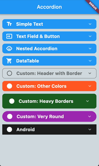
Simple to use accordion widget with lots of preset properties. Use the maxOpenSections property to automatically close sections when opening a new section. This is especially helpful if you always want your list to look clean -- just set this parameter to 1 and whenever you open a new section the previous one closes. The initial opening animation of sections is hardcoded so far, but the scrollIntoView paramter can be set to fast, slow, or none. This parameter will only take affect if there are enough items in the list so scrolling is feasible.
Many parameters can be set globally on Accordion as well as individually on each AccordionSection (see list below).
The header consists of the left and right icons (right icon is preset to arrow down). Both can be set globally and individually. The headerText parameter is required and needs to be set for each AccordionSection.
The content area basically provides the container in which you drop whatever you want to display when AccordionSection opens. Background and borders can be set globally or individually per section.
Enjoy!
 |
Sample Code #
Accordion(
	maxOpenSections: 2,
	headerTextStyle: TextStyle(color: Colors.white, fontSize: 17, fontWeight: FontWeight.bold),
	leftIcon: Icon(Icons.audiotrack, color: Colors.white),
	children: [
	AccordionSection(
		isOpen: true,
		headerText: 'Introduction',
		content: Text('This is the introduction right here ...'),
	),
	AccordionSection(
		isOpen: true,
		headerText: 'About Us',
		content: Icon(Icons.airline_seat_flat, size: 120, color: Colors.blue[200]),
	),
	AccordionSection(
		isOpen: true,
		headerText: 'Company Info',
		content: Icon(Icons.airplay, size: 70, color: Colors.green[200]),
	),
	],
),
Common Properties #
The following properties can be set globally for all sections or for each section individually:
| Property | Description | Type | Required | Default value |
|---|---|---|---|---|
| headerBackgroundColor | background color of the section header | Color | no | primaryColor (of theme) |
| headerBorderRadius | border radius of the section header | double | no | 30 |
| headerTextAlign | alignment of the title in the section header | TextAlign | no | TextAlign.left |
| headerTextStyle | text style of the title in the section header | TextStyle | no | TextStyle(color: Colors.white, fontSize: 20, fontWeight: FontWeight.bold) |
| headerPadding | padding of the title in the section header | EdgeInsets | no | EdgeInsets.symmetric(horizontal: 20, vertical: 10) |
| leftIcon | widget to the left of the title in the section header | Widget | no | null |
| rightIcon | widget to the right of the title in the section header | Widget | no | Icon(Icons.keyboard_arrow_down, color: Colors.white60, size: 20) |
| flipRightIconIfOpen | if the right icon in the header should be flipped when section is open | bool | no | true |
| contentBackgroundColor | background color of the content part of the section | Color | no | Colors.white |
| contentBorderColor | border color of the content part of the section | Color | no | Colors.white |
| contentBorderWidth | border width of the content part of the section | double | no | 0 |
| contentBorderRadius | border radius of the content part of the section | double | no | 20 |
| contentHorizontalPadding | horizontal padding within the content part of the section | double | no | 10 |
| contentVerticalPadding | vertical padding within the content part of the section | double | no | 10 |
| paddingBetweenClosedSections | padding below closed sections | double | no | 3 |
| paddingBetweenOpenSections | padding below an open section to visually make it stand out more | double | no | 10 |
| scrollIntoViewOfItems | if a section should automatically be scrolled to the center of the list when opened | ScrollIntoViewOfItems | no | ScrollIntoViewOfItems.fast |
Properties for Accordion #
| Property | Description | Type | Required | Default value |
|---|---|---|---|---|
| maxOpenSections | maximum number of open sections at any given time. Opening a new section will close the "oldest" open section | int | no | 1 |
| children | the list of AccordionSection |
List | YES | [] |
| paddingListTop | padding of the Accordion list at the top |
double | no | 20.0 |
| paddingListBottom | padding of the Accordion list at the bottom |
double | no | 40.0 |
| paddingListHorizontal | horizontal padding of the Accordion list |
double | no | 10.0 |
Properties for AccordionSection #
| Property | Description | Type | Required | Default value |
|---|---|---|---|---|
| isOpen | if this section should initially be displayed open or not | bool | no | false |
| headerText | the title text | String | YES | "" |
| content | the widget you want to display as the visible content when the section is open | Widget | YES | |
| paddingListBottom | padding of the Accordion list at the bottom |
double | no | 40.0 |
| paddingListHorizontal | horizontal padding of the Accordion list |
double | no | 10.0 |
Metadata
Publisher
Metadata
Accordion widget to display a list of expandable items with opening/closing and scroll-into-view animations.
Homepage
Repository (GitHub)
View/report issues
License
 unknown (LICENSE)