feature_discovery 0.14.1  feature_discovery: ^0.14.1 copied to clipboard
A Flutter package that implements Material Design Feature discovery to show a description of specific features to new users. See https://tinyurl.com/FeatureDiscovery
feature_discovery #
This Flutter package implements Feature Discovery following the Material Design guidelines.
With Feature Discovery, you can add context to any UI element, i.e. any Widget in your Flutter app.
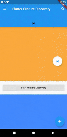
Here is a small demo of the example app:
Installing #
To use this package, follow the installing guide.
Usage #
FeatureDiscovery #
To be able to work with any of the global functions provided by the feature_discovery package, you will have to wrap your widget tree in a FeatureDiscovery widget.
There are many places where you can add FeatureDiscovery in your build tree, but the easiest to assure that it sits on top is to wrap your MaterialApp with it:
const FeatureDiscovery(
  child: MaterialApp(
   ...
  )
)
DescribedFeatureOverlay #
For every UI element ( Widget ) that you want to describe using Feature Discovery, you will need to add a DescribedFeatureOverlay .
This widget takes all the parameters for the overlay that will be displayed during Feature Discovery and takes the Widget you want to display the overlay about as its child .
Feature ids
Every feature you describe should have a unique identifier, which is a String passed to the featureId parameter. You will also need to provide these ids when starting the discovery.
And library will use this ids to save flag internally to indicate which feature is showed to user and completed by user.
And if this feature is completed by user library will not show it again.
DescribedFeatureOverlay(
  featureId: 'add_item_feature_id', // Unique id that identifies this overlay.
  tapTarget: const Icon(Icons.add), // The widget that will be displayed as the tap target.
  title: Text('Add item'),
  description: Text('Tap the plus icon to add an item to your list.'),
  backgroundColor: Theme.of(context).primaryColor,
  targetColor: Colors.white,
  textColor: Colors.white,
  child: IconButton( // Your widget that is actually part of the UI.
    icon: cons Icon(Icons.add),
    onPressed: addItem,
  ),
);
Additional parameters
contentLocation
This is ContentLocation.trivial by default, however, the package cannot always determine the correct placement for the overlay. In those cases, you can provide either of these two:
-
ContentLocation.below: Text is displayed below the target. -
ContentLocation.above: Text is displayed above the target.
onComplete
   onComplete: () async {
    // Executed when the tap target is tapped. The overlay will not close before
    // this function returns and after that, the next step will be opened.
    print('Target tapped.');
    // You can prevent completion by returning false.
    return true;
  },
onDismiss
  onDismiss: () async {
    // Called when the user taps outside of the overlay, trying to dismiss it.
    print('Overlay dismissed.');
    // You can prevent dismissal by returning false.
    return true;
  },
onOpen
  onOpen: () async {
    // This callback is called before the overlay is displayed.
    print('The overlay is about to be displayed.');
    // If you return false, the overlay will not be opened and the next step
    // will be attempted to open.
    return true;
  },
enablePulsingAnimation
This is set to true by default, but you can disable the pulsing animation about the tap target by setting this to false .
allowShowingDuplicate
If multiple DescribedFeatureOverlay s have the same featureId , they will interfere with each other during discovery and if you want to display multiple overlays at the same time, you will have to set allowShowingDuplicate to true for all of them.
barrierDismissible #
This is set to true by default, but you can disable "dissmiss overlay on touch outside" by setting this to false .
overflowMode
This is OverflowMode.ignore by default, which will simply render the content you pass to title and description , even if it overflows the background area, i.e. the circle of the overlay. Alternatively, you can specify any of the following if you desire different behavior:
-
OverflowMode.clipContentwill clip any content that is outside of the inner area (the background's circle). -
OverflowMode.extendBackgroundwill expand the background circle if necessary. -
OverflowMode.wrapBackgroundwill expand the background circle if necessary, but also shrink it if the content is smaller than the default background size.
FeatureDiscovery.discoverFeatures #
When you want to showcase your features, you can call FeatureDiscovery.discoverFeatures with the applicable feature ids. The features will be displayed as steps in order if the user does not dismiss them.
By tapping the tap target, the user will be sent on to the next step and by tapping outside of the overlay, the user will dismiss all queued steps.
FeatureDiscovery.discoverFeatures(
  context,
  const <String>{ // Feature ids for every feature that you want to showcase in order.
    'add_item_feature_id',
  },
);
If you want to display Feature Discovery for a page right after it has been opened, you can use SchedulerBinding.addPostFrameCallback in the initState method of your StatefulWidget :
@override
void initState() {
  // ...
  SchedulerBinding.instance.addPostFrameCallback((Duration duration) {
    FeatureDiscovery.discoverFeatures(
      context,
      const <String>{ // Feature ids for every feature that you want to showcase in order.
        'add_item_feature_id',
      },
    );
  });
  super.initState();
}
FeatureDiscovery.clearPreferences #
If you want to clear feature discovery flag use this command like that
FeatureDiscovery.clearPreferences(context, <String>{ 'add_item_feature_id', });
FeatureDiscovery.hasPreviouslyCompleted #
If you want to findout feature discovery is Displayed or not ? use this command like that
FeatureDiscovery.hasPreviouslyCompleted (context,'desired_feature_id');
Other methods
You can view the API reference for FeatureDiscovery to find other useful methods for controlling the Feature Discovery process programmatically.
EnsureVisible #
You can use the EnsureVisible widget to automatically scroll to widgets that are inside of scrollable viewports when they are described during Feature Discovery:
// You need to save an instance of a GlobalKey in order to call ensureVisible in onOpen.
GlobalKey<EnsureVisibleState> ensureVisibleGlobalKey = GlobalKey<EnsureVisibleState>();

// The widget in your build tree:
DescribedFeatureOverlay(
  featureId: 'list_item_feature_id',
  tapTarget: const Icon(Icons.cake),
  onOpen: () async {
    WidgetsBinding.instance.addPostFrameCallback((Duration duration) {
      ensureVisibleGlobalKey.currentState.ensureVisible();
      return true;
    });
  },
  title: Text('Cake'),
  description: Text('This is your reward for making it this far.'),
  child: EnsureVisible(
    key: ensureVisibleGlobalKey,
    child: const Icon(Icons.cake),
  ),
)
Notes #
In DescribedFeatureOverlay , tapTarget , title , and description can take any widget, but it is recommended to use an Icon for the tap target and simple Text widgets for the title and description. The package takes care of styling these widgets and having these as Widget s allows you to pass Key s, Semantics , etc.
Contributing #
If you want to start contributing to this package, it is recommended to refer to the contributing guide.
Gratitude #
Thanks to mattcarroll for their Flutter challenge about Feature Discovery on Fluttery.
Metadata
Publisher
unverified uploader
Metadata
A Flutter package that implements Material Design Feature discovery to show a description of specific features to new users. See https://tinyurl.com/FeatureDiscovery
Repository (GitHub)
View/report issues
Contributing
Documentation
License
 MIT (LICENSE)
Dependencies
flutter, provider, shared_preferences